204 Park House Build: The Bathrooms
A few weeks back I shared the news that James and I bought a house. We actually bought the house before Christmas but as we're building, the process has been slowly moving along and now that we're into spring we're fully framed, closed in with windows and doors and the fun stuff is starting to happen!
I also mentioned that this process has not been all sunshine and roses. As an interior designer I've had grand plans for this house since before we put in our offer but as I've been learning, James and I have incredibly different ideas when it comes to design styles and who'da thunk - he's also very opinionated on the design, finishes and decor for our new place which, for a girl like me who likes to get her way, has been majorly annoying! haha
Today I thought I'd share our plans for the bathrooms, our inspirations, choices and what we still need to finalize; AKA - help me!
The Inspiration
This image has been my inspiration right from day one, before we even selected our house. I am absolutely loving all of the hex tiles that I'm seeing everywhere lately (they're definitely having a moment) and I love that they're trendy now but also a classic modern design style that wouldn't age and tire quickly. The dark floor, walnut accents and white contrast is definitely a theme that we took from this washroom and carried into our plans.
I actually found a hex floor tile that I fell in love with right from day one but as we've moved along with our selections, we decided that the upgrade wasn't worth the investment. That being said we found a beautiful 12x24 charcoal tile from Julian within our allowance that will give the same visual affect despite lacking a bit of the hexagon's pizzaz.
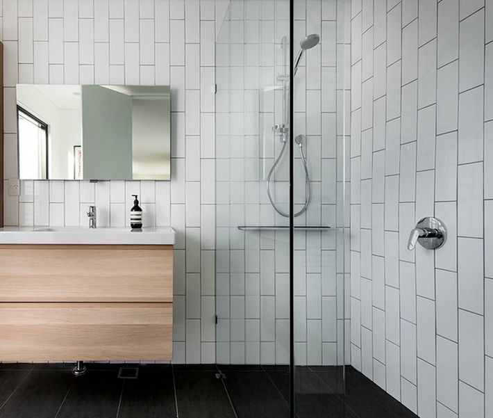
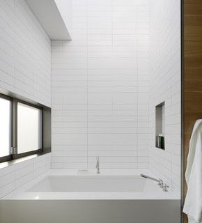
These two images below (left/right) are also inspiration photos we used to help us narrow down our choices. Basically you can tell that we're going for white subway tile and walls, walnut accents, a dark floor and brass and black fixtures. I would have loved to lay the floor in a herringbone layout but again, seeing as this is our first home together, we decided to keep things cost conscious so we're going with an offset layout.
So now that you've seen our inspiration, let's take a look at what we actually selected/are still in the process of finalizing, shall we….
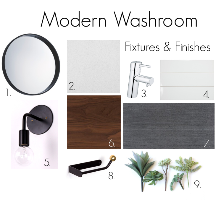
1. Our mirrors aren't finalized but I'm hoping to do something a little more design focussed than the standard builder mirrors. In the en-suite I'm looking to use a round mirror with sconces on either side and in the other washrooms, a rectangular mirror framed with walnut or black. These are still TBD but the above inspiration photos show what we're looking to achieve. Stay tuned to see what we pick or send any suggestions my way!
2. We decided to upgrade the countertops from laminate to quartz so our countertops in the washrooms are going to be Bianco Quartz (AKA straight up white and simple). To keep the room feeling bright and clean and modern we've also decided to use the same quartz as our 3" backsplash. We had originally selected a stunning herringbone tile (below) as our backsplash but decided that to get the best impact with the tile, we'd need to use more of it than just a small backsplash and well, at $60 per tile, that just put things a little out of budget so, quartz it is! Despite the simpler look I actually think it will be great for keeping the look clean and simple and letting other accents stand out.
3. The faucets in the washrooms are modern, minimal and simple. We've upgraded from the basic builder spec to Grohe fixtures in a brushed finish. My initial requests for brass and then black fixtures were shut down hard by James despite my best efforts to sway him so these guys were definitely a compromise but thankfully mixing metals is totally acceptable these days so I'm planning to incorporate brass and black elsewhere.
4. We decided to upgrade the standard shower inserts for a nicer tub with tile in the main bath and a ceramic base and full tiled shower in the en-suite. The showers in the en-suite and main washroom will both be tiled in a 4x12 white glossy subway tile. I had hoped to install the tile in a vertical offset pattern (below left) but in keeping it real around here, I'll say that James was very against it. So, with another battle lost (lol!), we compromised on a very contemporary grid pattern layout like this one (below right) and our grout will be a soft grey that will be consistent with the subway shower and the dark floor tiles.
5. Our lighting is still undecided. (Help me here people!!) Like I mentioned above I'm hoping to select wall sconce lighting for the en-suite washroom but haven't finalized anything yet. I love the look of a simple sconce like this one in the photo, either in black or bronze or a combination of both. So now my next mission is to find affordable washroom lighting for 3 washrooms that's contemporary and minimal but with a bit of design flair.
6. This walnut sample represents our bathroom vanities. We've decided to float our vanities to enhance our contemporary look. We'll select minimal hardware so that the beautiful walnut is what stands out. The warm wood is going to look so great against the dark floor and the light tile and walls, I'm really excited to see how it comes together!
7. Like I mentioned we had to compromise on our floor tile big time. Hexagon floor tiles or laying our tiles in a herringbone pattern put us WAAAY out of budget but as soon as I saw this tile from Julian I fell in love. It's a gorgeous dark charcoal that has great variance and texture that is subtle but will definitely make a statement.
8. We've opted to select our own washroom accessories (towel bar, toilet paper holder) because we weren't totally thrilled with any of our builder options. Again, I'm hoping to find something a little more interesting than the usual and I love the look of this piece so now I'm scouring the net and other sources to try to find something both beautiful and functional. Suggestions anyone?!
9. The final element of the washroom plan will be greenery and lots of it. Because we're going quite contemporary with our finishes, I'll want to warm the space up and add a few natural elements of greenery to keep the spaces from feeling cold. White fluffy towels, lots of candles and a lot of greenery should be the perfect accents to liven up the rooms!


