Modern Moroccan Showhome Reveal!
You might remember the Instagram pictures that I posted back in January of a showhome that I was working on?
Well, I promised more pictures of the final product and here they are!
I grew to really like the 'Modern Moroccan' theme, even though I’m normally a cool toned neutrals girl. This house pushed me out of my comfort zone big time, which is always a bit scary and a lot fun. The scary part is the planning, and the fun part is when it all comes together!
I kept most of the major, permanent parts of the home - cabinets, paint colour, flooring, etc - fairly neutral, and kept the bright pops of colour and playful, Moroccan themed patterns to the accents. Think wallpaper, bedding, cushions, and wall décor. The most important thing that I focused on was trying not to take anything too seriously - over the years I’ve learned that it's the key to having fun with design!
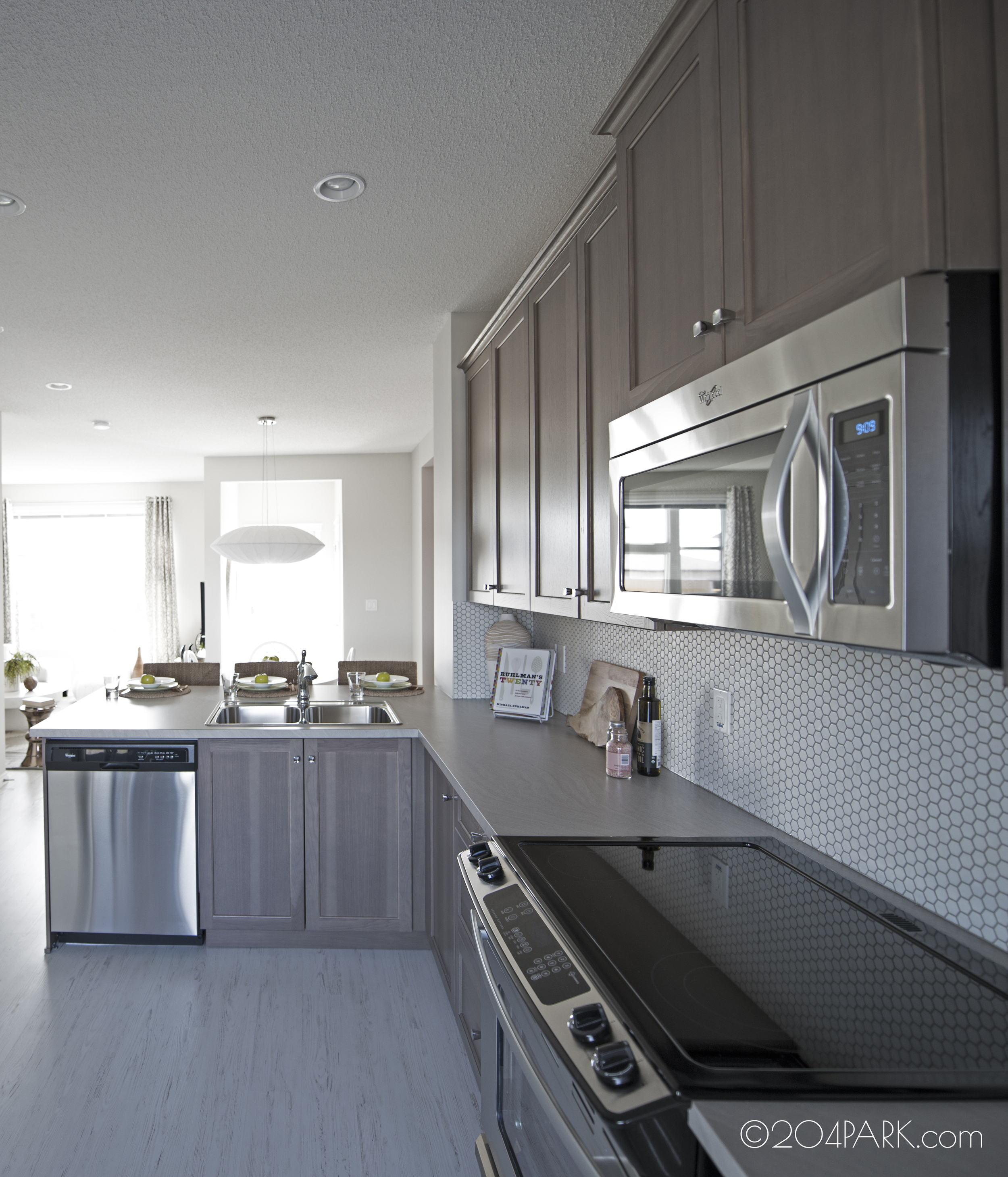
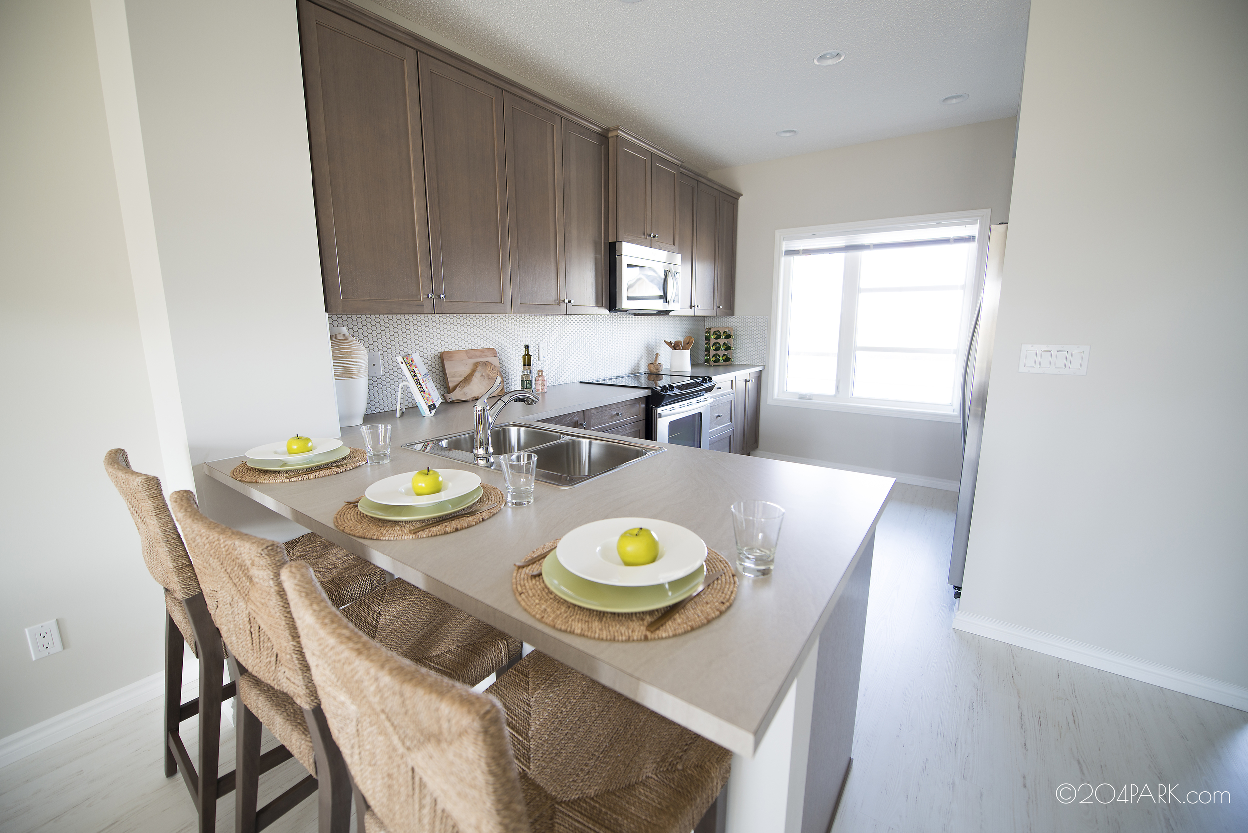
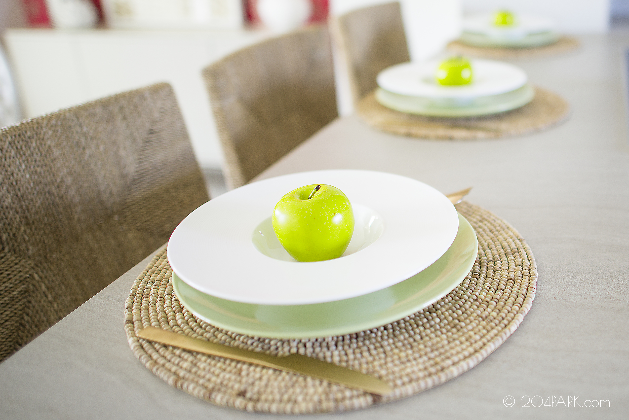
Let’s start with the kitchen: neutral cabinets and countertops let the fab hexagonal backsplash tile take center stage. I don’t like things to get too fake or kitchy, so no fake wine in glasses or faux baguettes here! Instead, I warmed up the hard surfaces with warm wood furnishings like the cool barstools and accessories like the cutting boards. I also added interesting textures like on the white vase from Target! Scroll through the images below to see all of the kitchen pics:
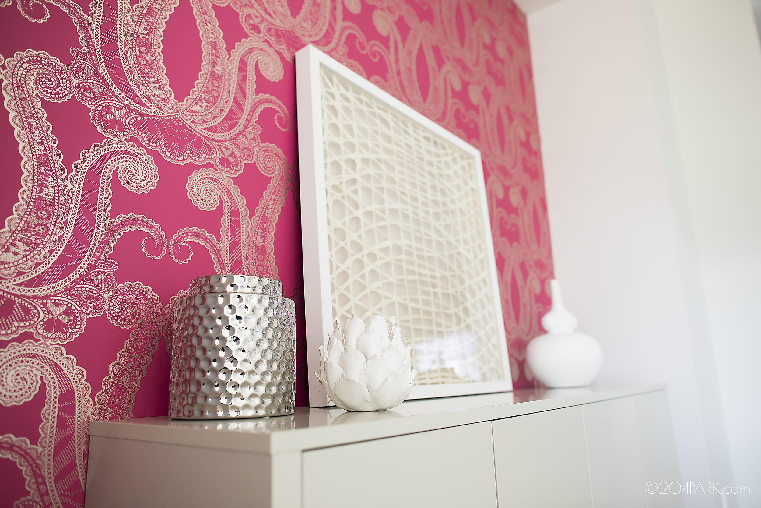
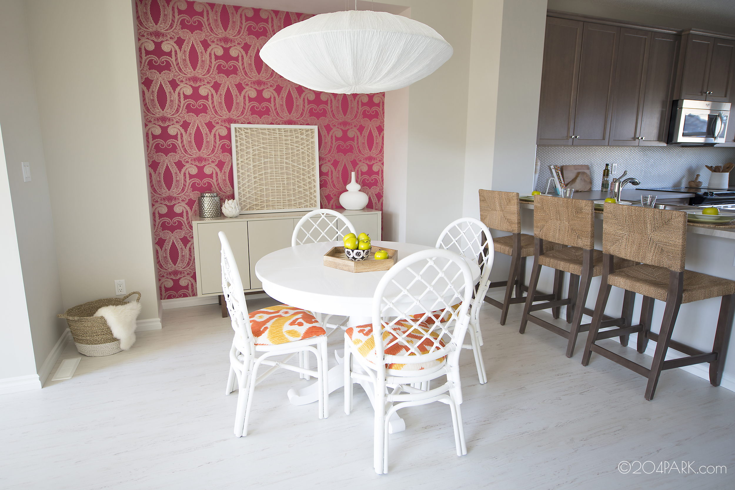
Next, the eating area – bringing in some serious colour and pattern here! I die for this wallpaper- it brings the most perfect pattern and colour combination into the space to become the ultimate focal point! Not only that but gold and pink? Puh-leeease! To keep things modern, I chose a clean lined cabinet (Ikea! For reals.) The dining table is Crate and Barrel, while the dining chairs were purchased from Kijiji, painted white and finished off with new vibrant gold and yellow ikat print fabric. Scroll below to see those bad boys if you can get past the wallpaper shot!
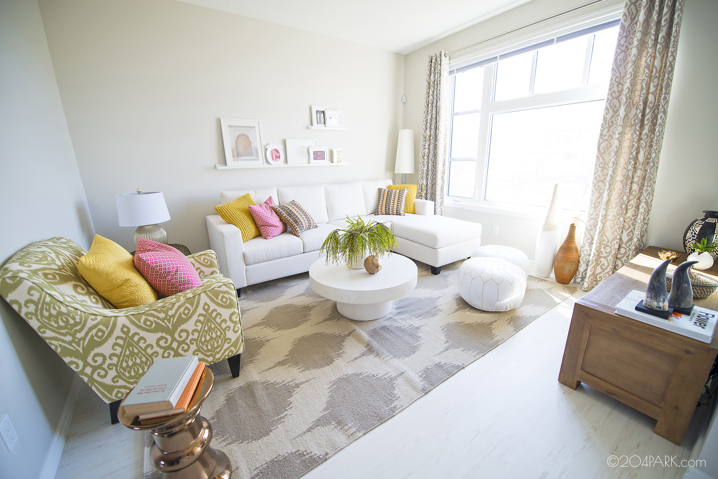
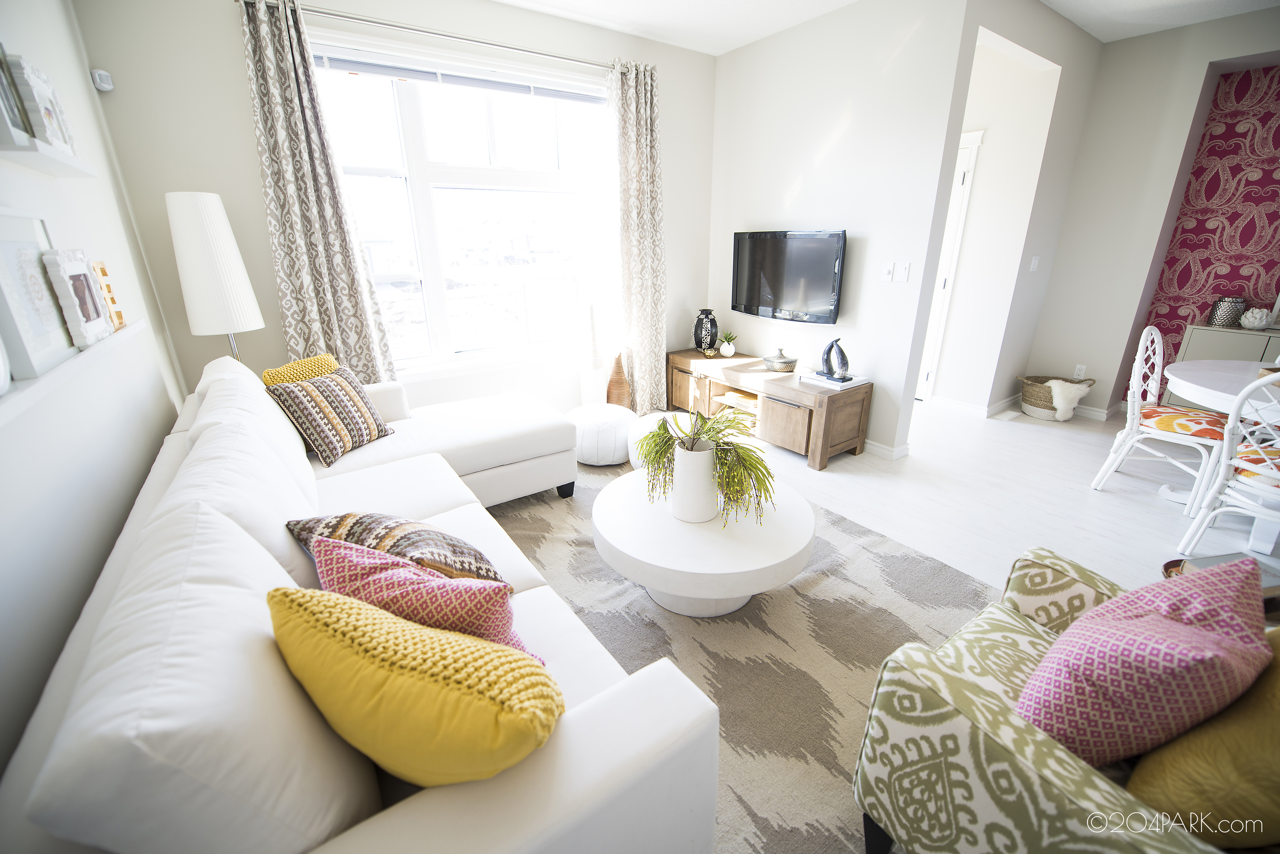
The comfy, eclectic living room is all about mixing colours and neutrals. Notice the patterned rug and how it works with the drapes? I threw in some fun cushions (custom made) and some frames on picture ledges and it instantly brought life to the room. Also, remember the poufs I’d been dying over?! Well, here they are! How we at 204 Park love love our poufs.
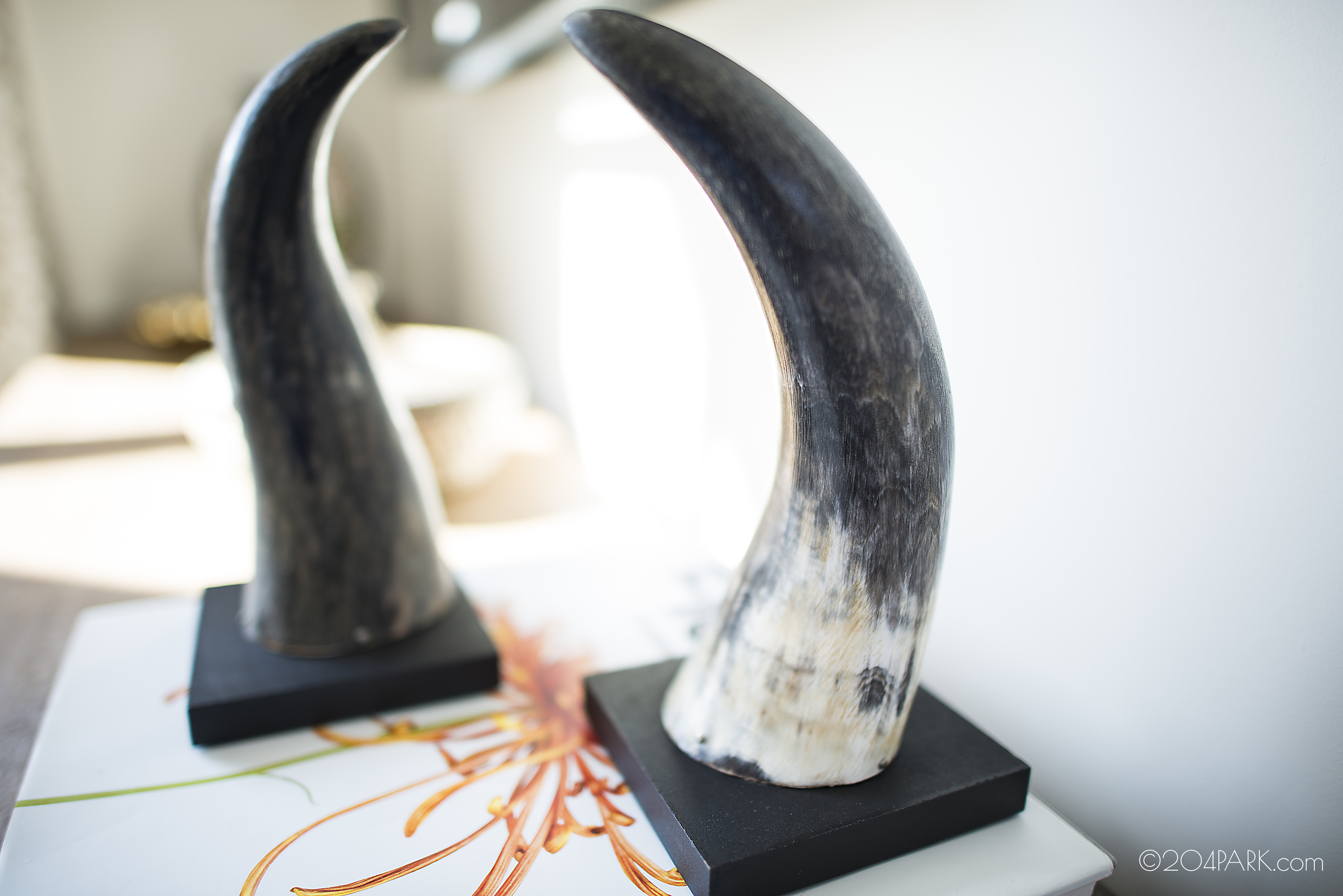
What‘s also important to me in design are unique accessories and vignettes. The moment I spotted these tusks (HomeSense, naturally), I knew I had to have them for this house. I love how they turned out!
In the bedrooms, I allowed myself to go a bit more crazy. I wanted to keep the living areas toned down a bit more so that I could really play with the upstairs rooms. Let’s start with the master!
How’s this for colourful wallpaper? It actually ended up being a bit brighter than I had originally imagined but that’s just design for you. I still like it, and the yellow picks up on the Anthropologie bedding as well. I finished the room off with a tiled dresser, more patterned draperies, and wooden carved side tables for the end of the bed.
For the guest bedroom, my jumping off point was this tasseled bedding, also from Anthroplogie! (click here for a close-up view of the cute detailing - looove it!). After I discovered the headboard, it was clear the direction that this room was going. I added some colourful drapes, a woven side table for a nightstand, and the cute blue stool - another HomeSense find. Are you starting to see a pattern here?
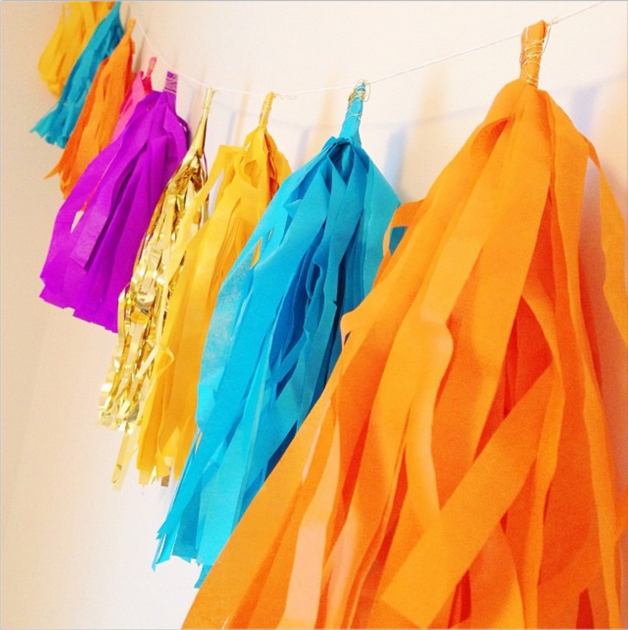
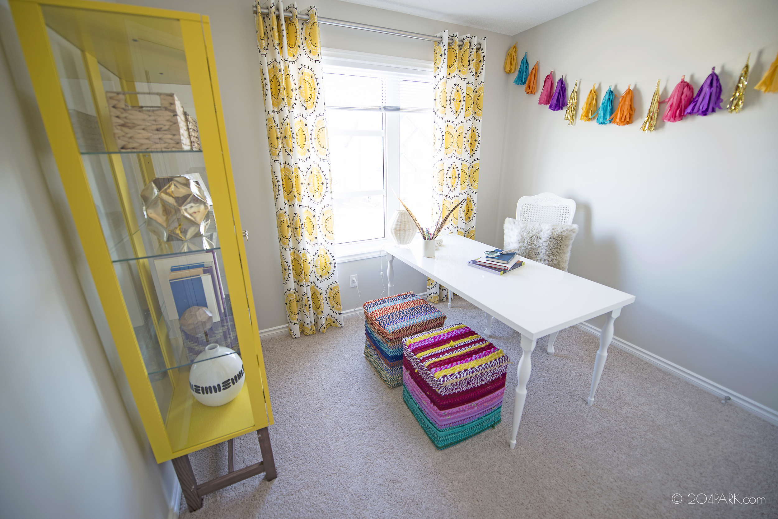
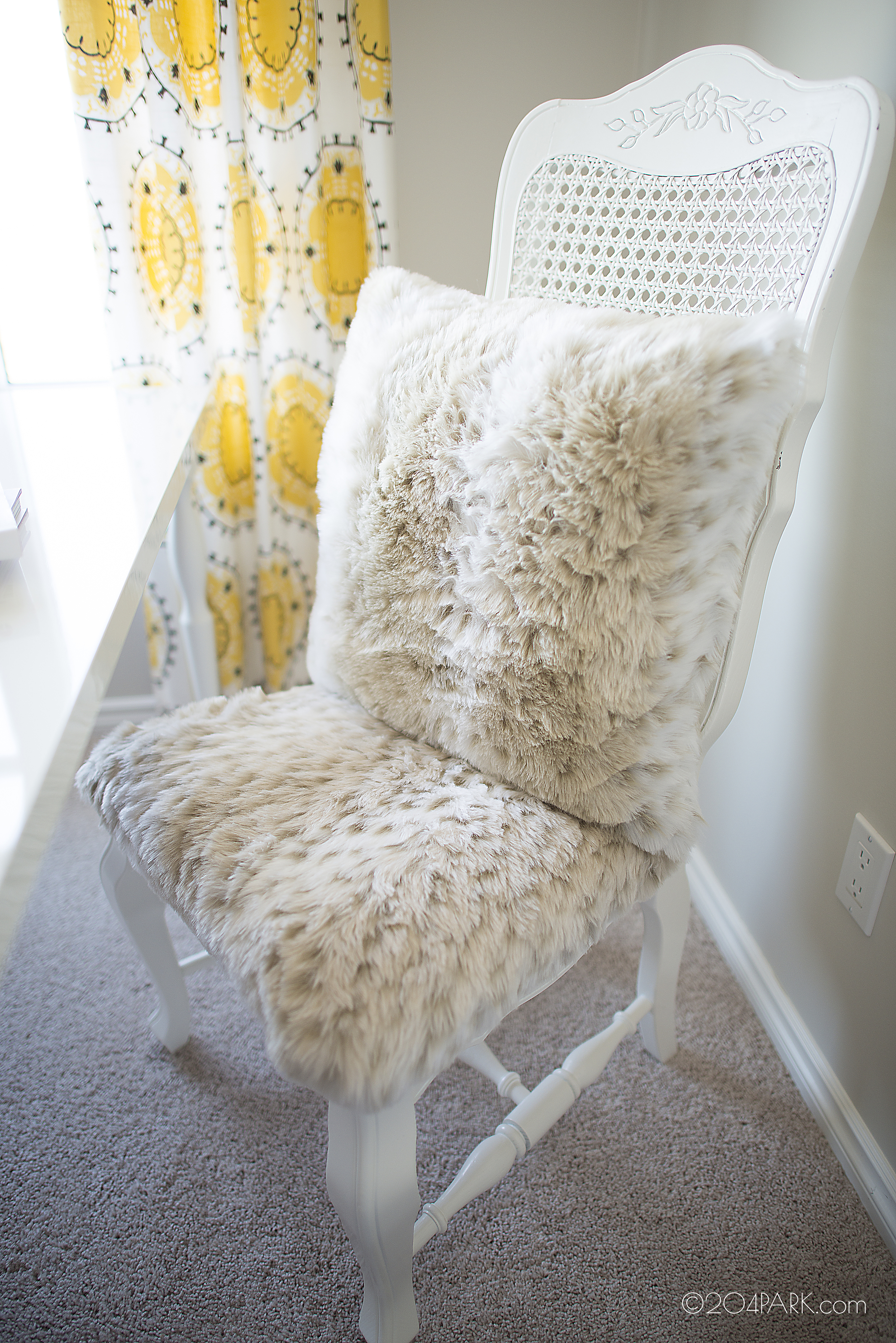
Next came the office. I found these cool, colourful boxes at HomeSense and needed to have them. I also got super inspired for a little animal print because I wanted to bring in another texture and a bit of fun - as if there wasn't enough already, right? So the desk chair was covered in faux fur and I found a pillow to match! I'm sure you remember the tassel garland that miss Diana made for me, which turned out perfectly, as only Diana's projects do. Click here to learn how to make your own! Lastly, this yellow cabinet - could it be any cuter? Again, scroll through the pictures below to see a close up of the chair:
Finally, the bathrooms in this small home were compact but still cute - I used the same hexagonal backsplash from the kitchen and added necessary details like hand towels, canisters for cotton balls, and a cute woven basket (Ikea) that fit the theme perfectly. And voila!
I'm so happy to finally be able to show you how this house came together! Is there anyone out there brave enough to bring this vibrant style in to your own home? We'd LOVE to see it!
Lastly, I tried to give you info on some of the more major furniture and accessory pieces in this home but not wanting to bombard you with too many details, not everything is listed. If there's anything you'd like more information on, comment below and I'll give you the scoop! I love helping people find the items that they're coveting.


