Dining Table Styling 3 Ways
Well hello & happy Wednesday everyone! Today I'm sharing the final room of the gorgeous country meets modern home I helped style a few weeks back. You might remember I helped create a beautiful but functional front entry space, revamped their living room to reflect her more modern tastes with his more rustic style and today - it's the dining room!
DINING ROOM DETAILS: Table // Chairs // End Chairs // Barstools
As I was styling this area I realized that I couldn't quite pick what styling arrangement was my favourite so I thought this would present the perfect opportunity for a little Dining Table Styling 101. I've said it before and I'll say it again - I'm not one to ever say you need to follow rules to a tee but there are a few basics that you can keep in mind while styling that will help make things easier if you're unsure. So here are a few of my tips...
Start with a good base
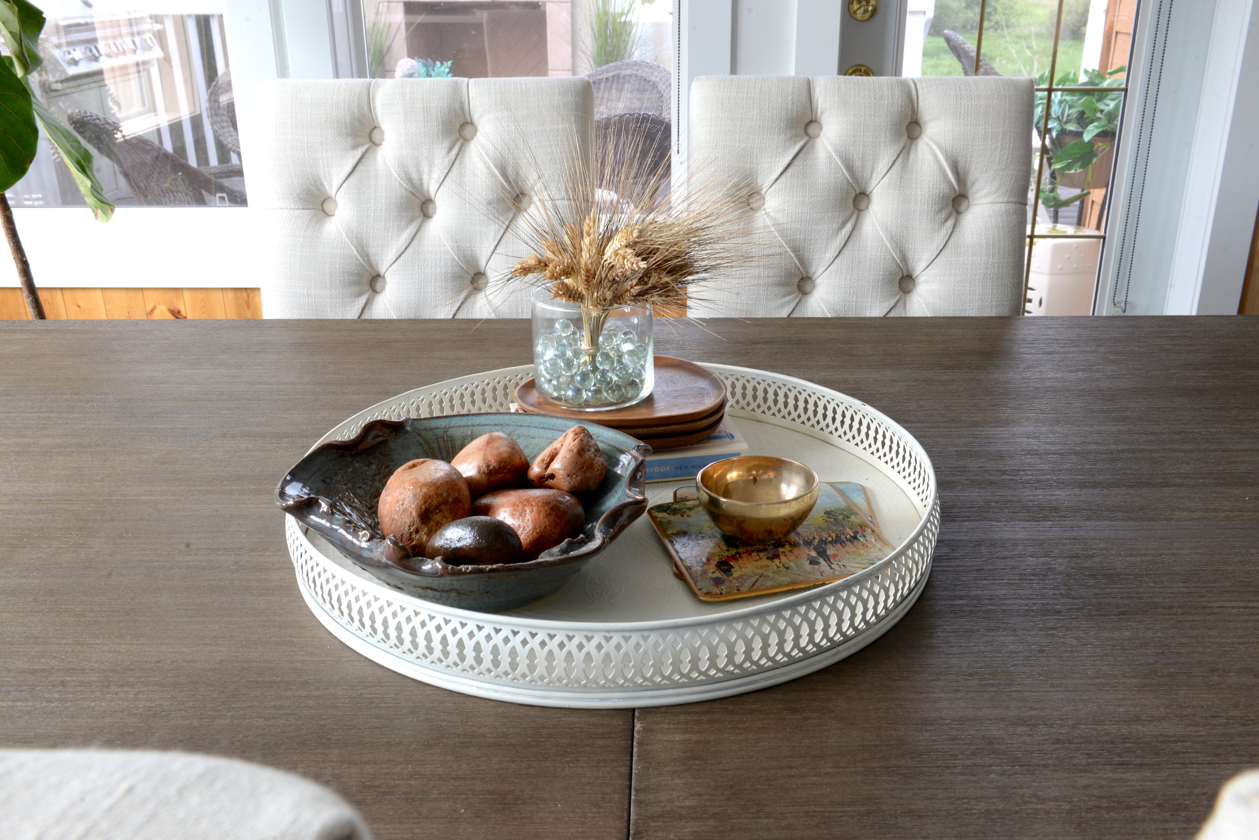
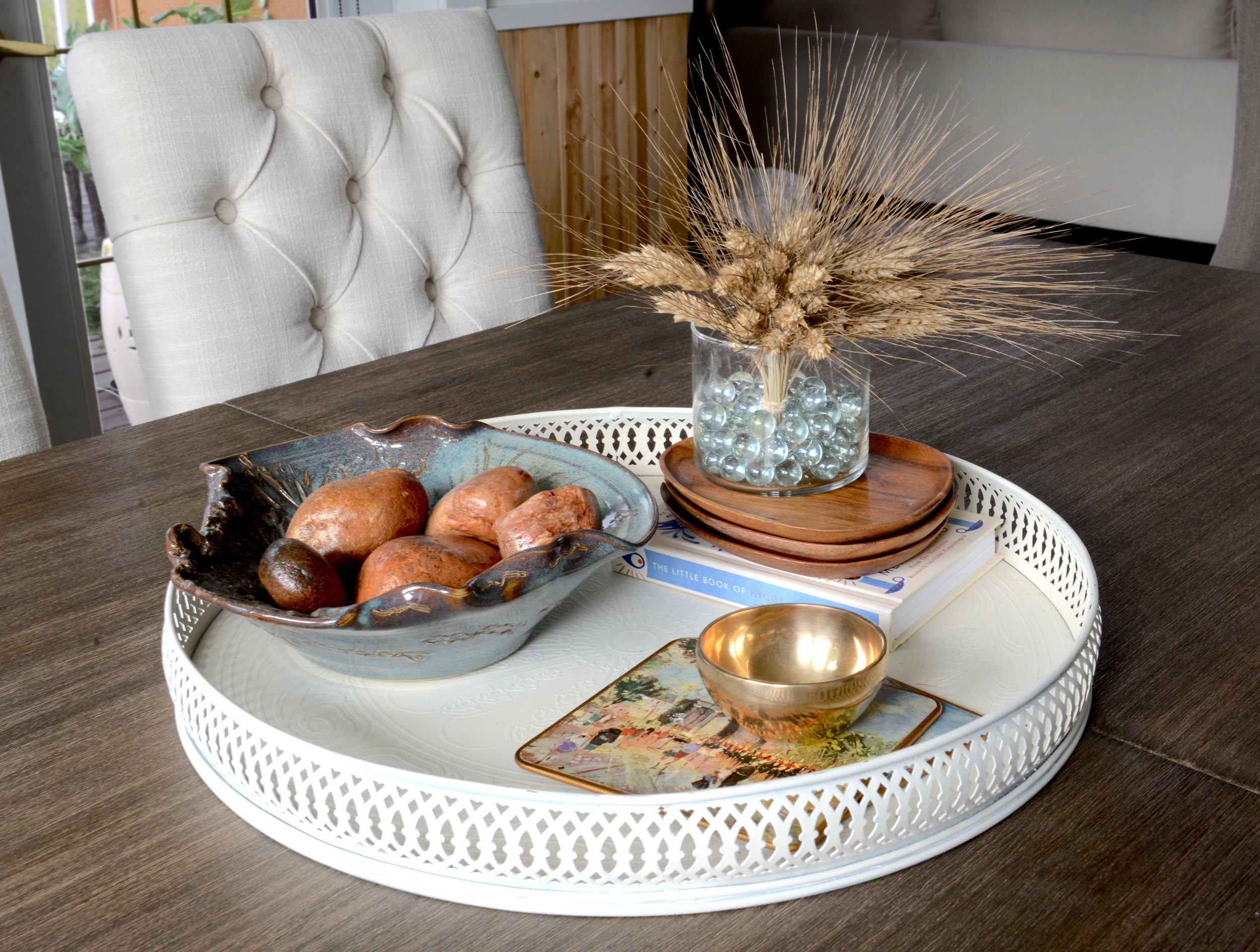
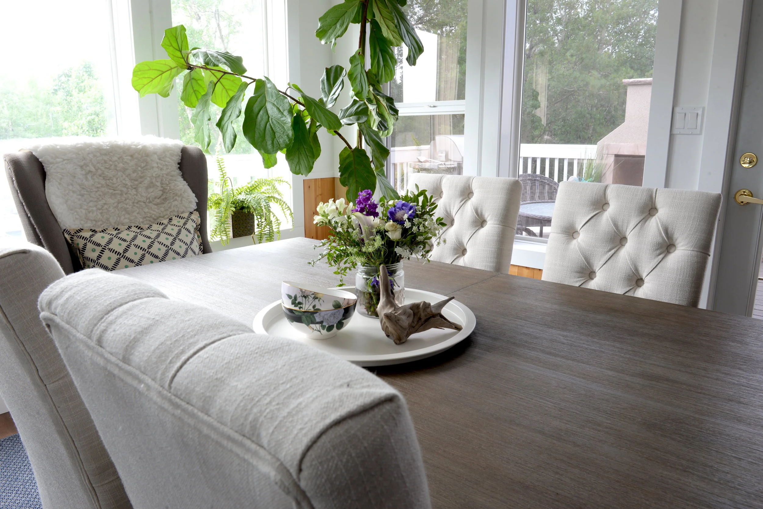
The best way to start your styled grouping is with a base. Use a tray, placemat, wooden or marble board as your base to build from. Since this table is a mid-tone wood and I wanted to keep the space bright and fresh I chose white and off white bases for each arrangement but don't be afraid to try out different styles and materials to see what suits your space best!
Group your items in 3's
The rule of 3's is a tried and true rule with decorating. Trios and vignettes in 3's (or odd numbers) tend to look best. Especially in this case where you're styling the center of a large table, a grouping with 3 items or styled groupings will look much better than an area styled with groupings in twos or fours. Just trust me on this one ;)
Bring in a touch of nature
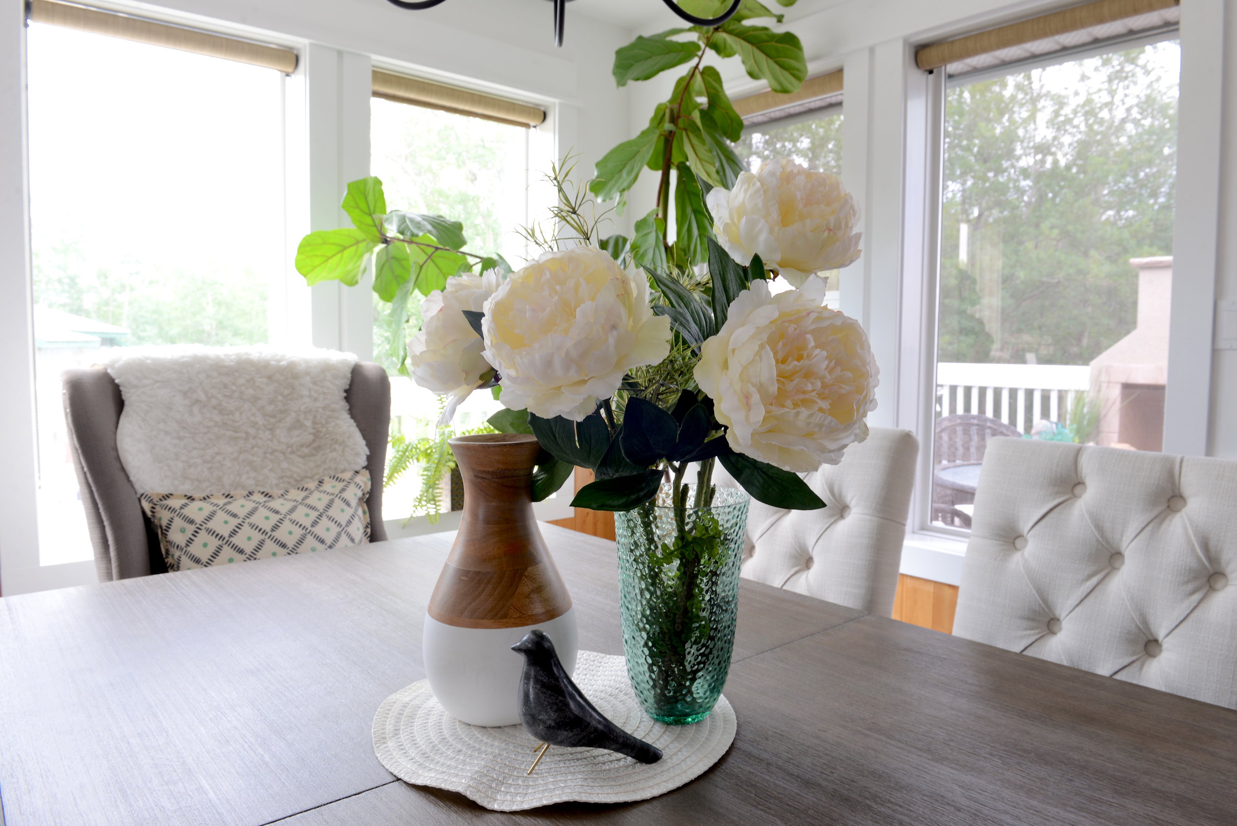
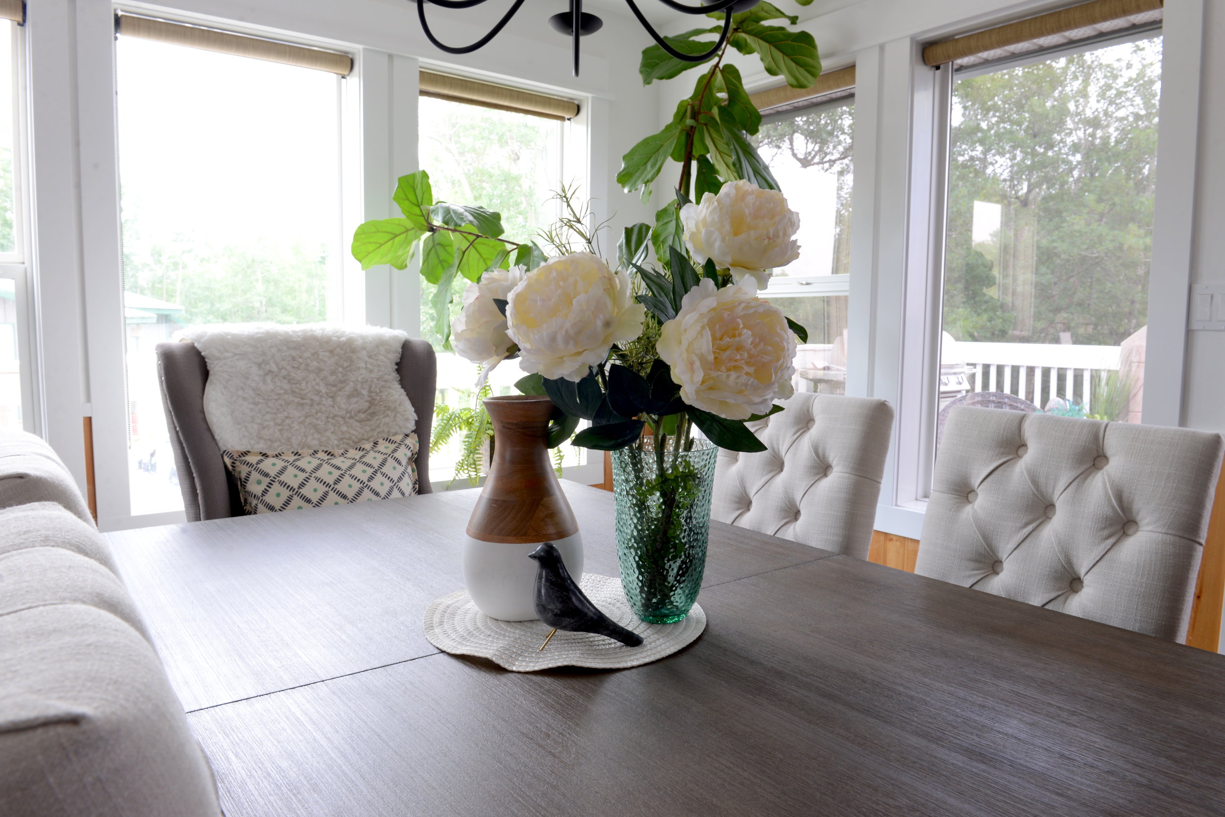
My next tip is to bring in a few natural elements. Whether you're bringing in real or faux flowers, driftwood, rocks or dried grasses or other natural accents, adding a bit of a touch from nature will work wonders for adding natural color, texture and visual interest to your styled grouping.
Add some height
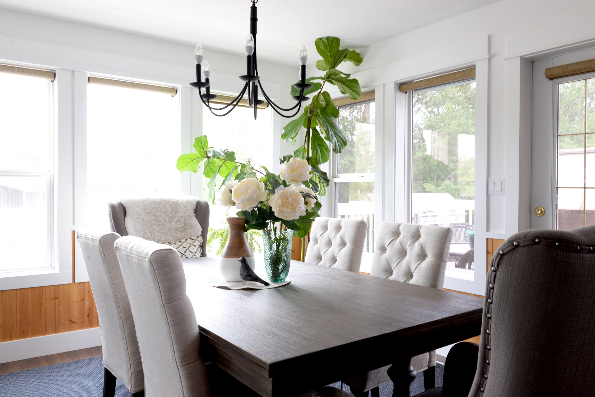
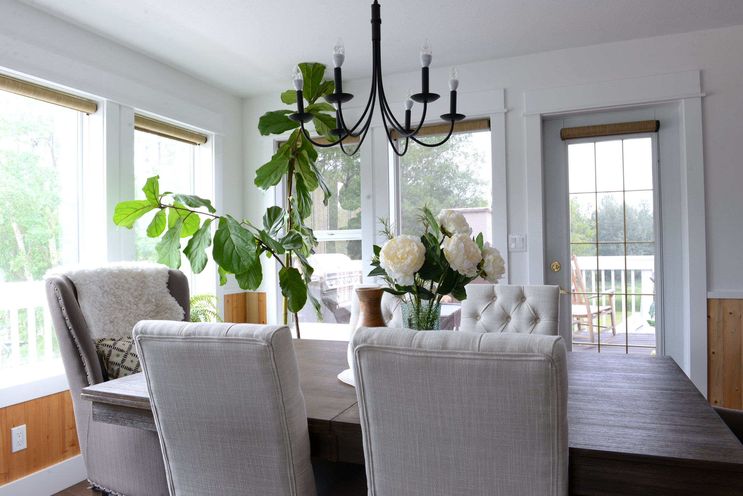
When styling any grouping it's important to get a bit of height in your grouping. My first grouping with the silk flowers shows tons of height for the most dramatic vignette. In a less dramatic but equally effective grouping, the real flowers are much taller than the driftwood and stacked dishes I have in my second grouping. While the overall height isn't really that tall, there's still enough of a difference between the flowers and the other items that it's enough of a contrast to be effective. In my final grouping, I stacked a few books underneath my vase with dried wheat to add a bit more height to the levels in that grouping. Don't be afraid to use books, boxes, coasters or other items to add levels to your grouping.
Vary your textures
My final tip for styling is to vary your textures. For visual interest it's always most effective to mix up your textures and finishes for the best look. Pair together soft textures with smooth, greenery and natural finishes with metallic ones. The tip I always tell people with decorating is we're not looking for pieces to "match" one another but rather, we're looking for items that compliment each other.
Ultimately, styling the perfect vignette will come down to you - your personal taste, how dramatic you want to be and what you have on hand or are willing to buy. It takes time and trial and error to learn the ways of styling. Even I always take much longer than I think I'll need to put together the perfect styled grouping so the most important thing to remember is to keep an open mind with what you can put together and to have fun with it!
Overall I'm so happy with how this space turned out! The Aspen Dining Table from The Brick was a great anchor for this space. With the fresh white walls and warm wooden features of this room, adding a bit of grey for contrast worked really well to bring in some contrast. I think it's safe to say that the Caroline Dining Chairs from the Brick have become my go-to chairs for transitional or more traditional spaces. And after long admiring the Hancock Park chair from online, I was so happy to finally get to use them as end chairs in this space, they're gorgeous! And the Glosco barstool just might be my new favourite backless stool - it worked so well as a high contrast against the white kitchen island.
Now tell me, which grouping was your favourite?!

