Introducing: #TheModernInMagrath
Well hello there everyone, I am SO EXCITED to share today’s post with you because today I’m sharing a peek at one of my favourite Kresswell Interiors projects to date, affectionately dubbed #TheModernInMagrath.
Every time we share another Kresswell Interiors project, it seems to become ‘my favourite’ but as much as I love all of our design projects, if I were to build a new home or renovate for myself, this kitchen and bathroom are basically what I’d pick for myself so it’s safe to say that I REAAALLLLY love this renovation! haha
So, let’s talk a bit about this project, shall we?!
This beauty of a home belongs to the lovely Sharon Litchfield who many of you may know and recognize as a ridiculously talented (and incredibly stylish and kind) photographer. Sharon has fabulous taste and a beautiful home in a great neighbourhood but her kitchen and bathroom were feeling a bit dark and dated. We were dealing with lots of dark wood millwork, awkward angles and wasted space in her kitchen and ensuite bathroom. Despite the dated finishes and design style these spaces had so much potential and as you’ll see - we think they turned out fabulously!
Let’s have a look at the kitchen first. …
BEFORE
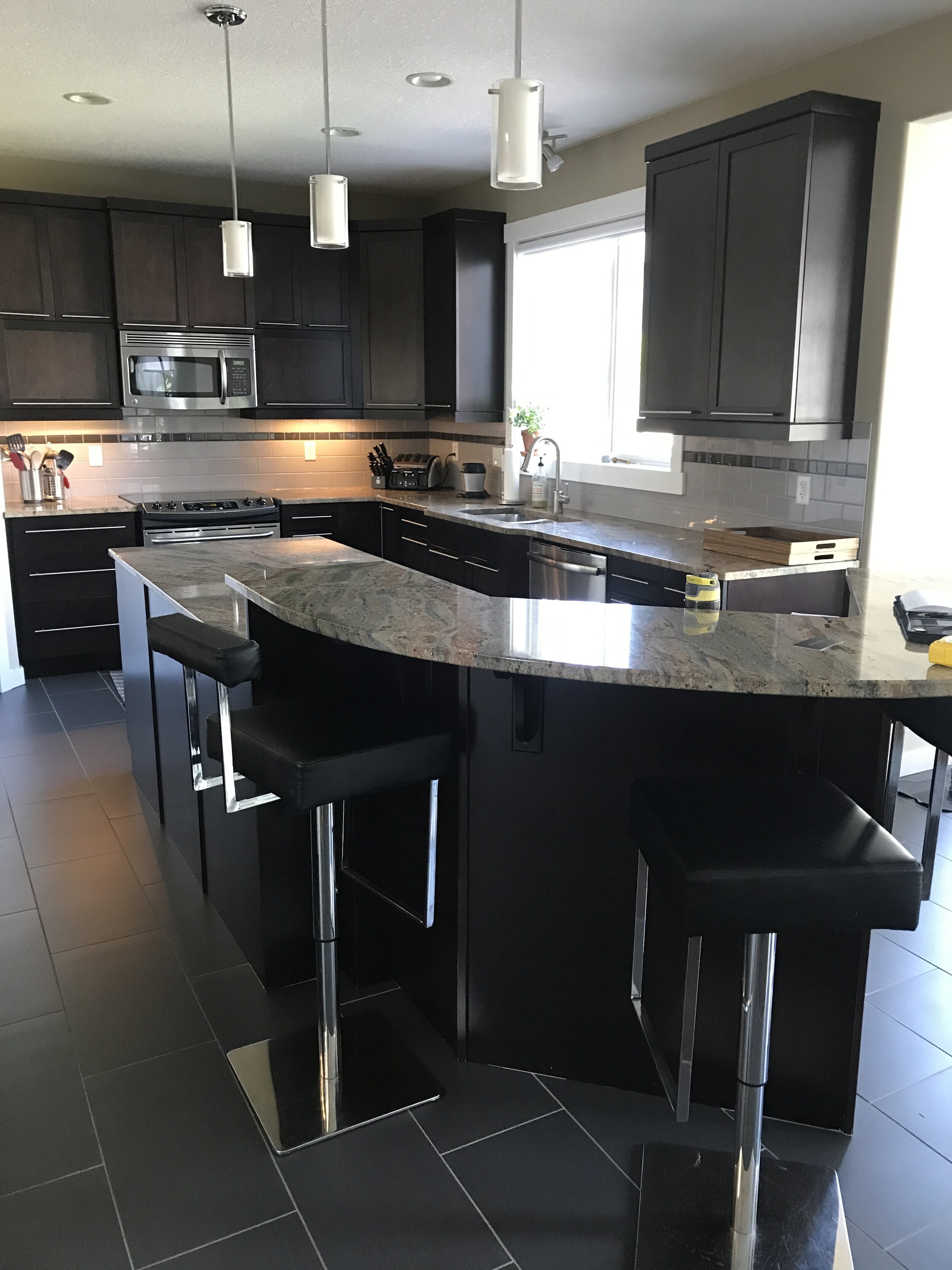
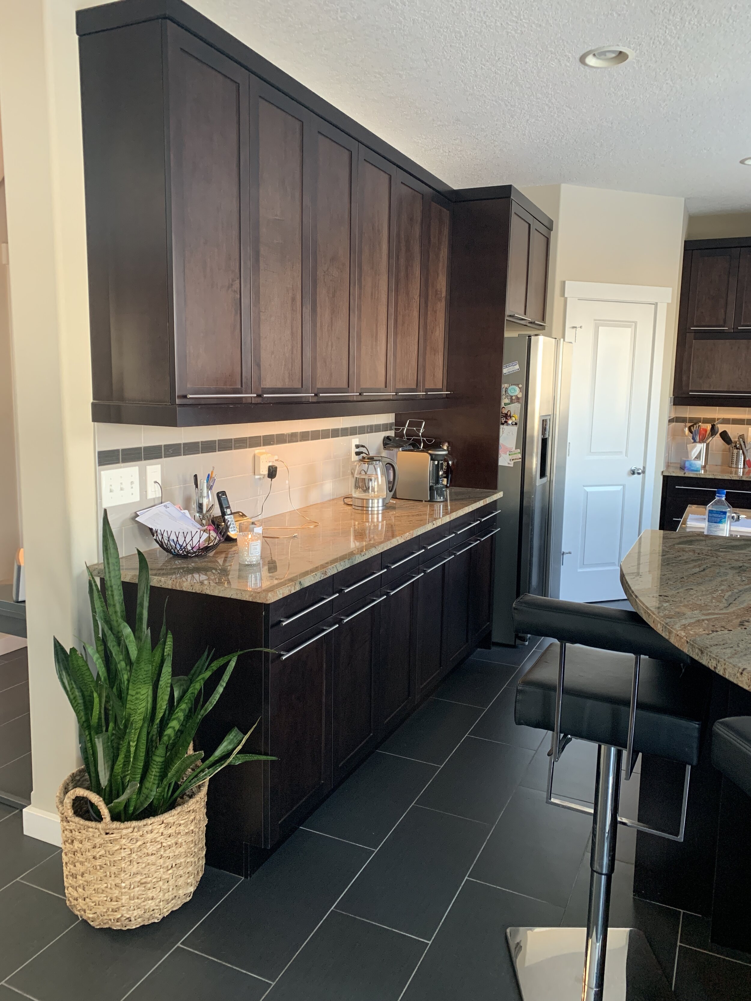
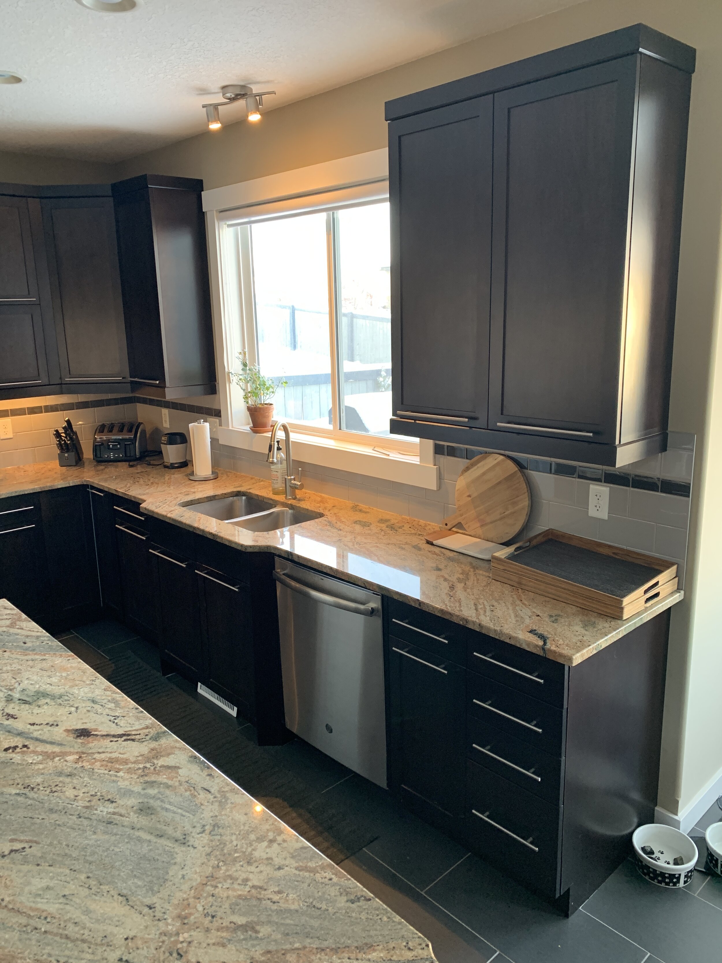
As you can see - this kitchen is a great size! Sharon had ample cabinetry but truthfully, more than she needed. The dark wood finish and large cabinet hardware was overpowering this room and the angled island dated the space. Fortunately for us though, this was a great space to work with, ample natural light and tall ceilings were all elements we wanted to emphasize.
THE PLAN
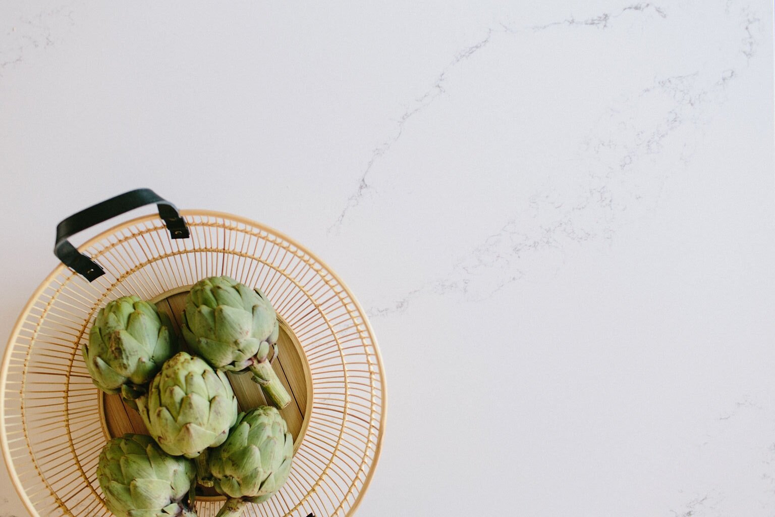
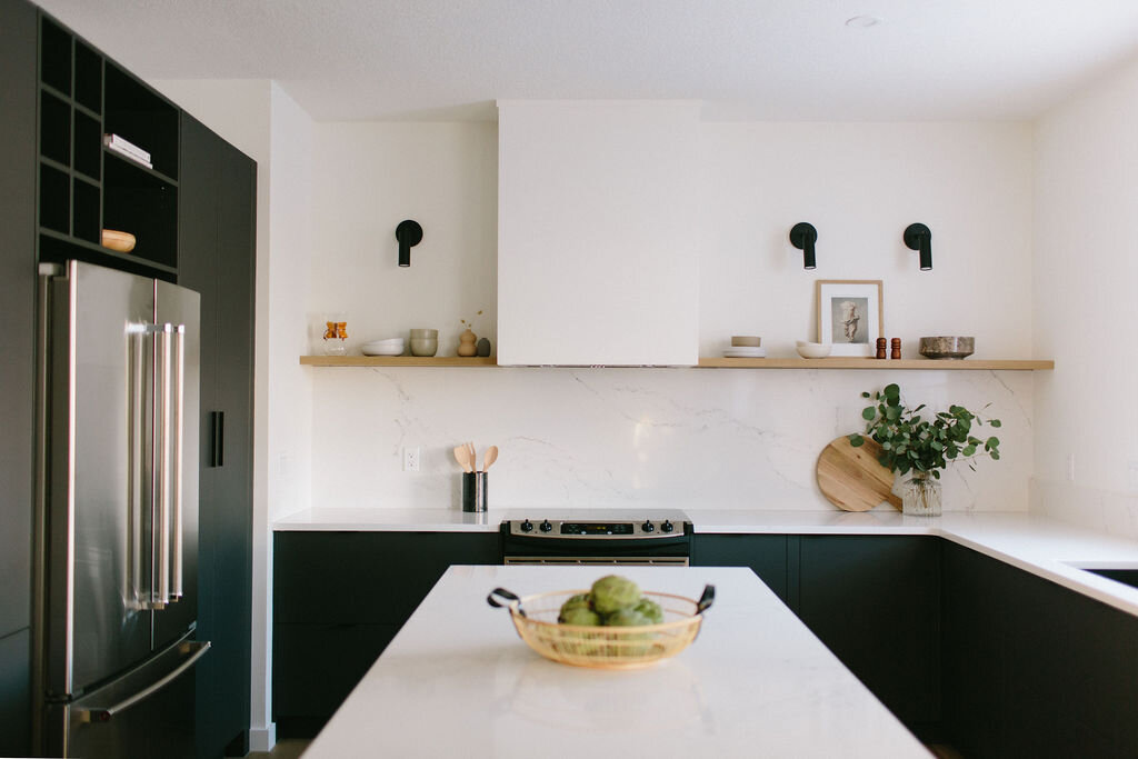
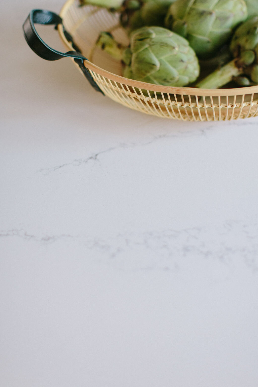
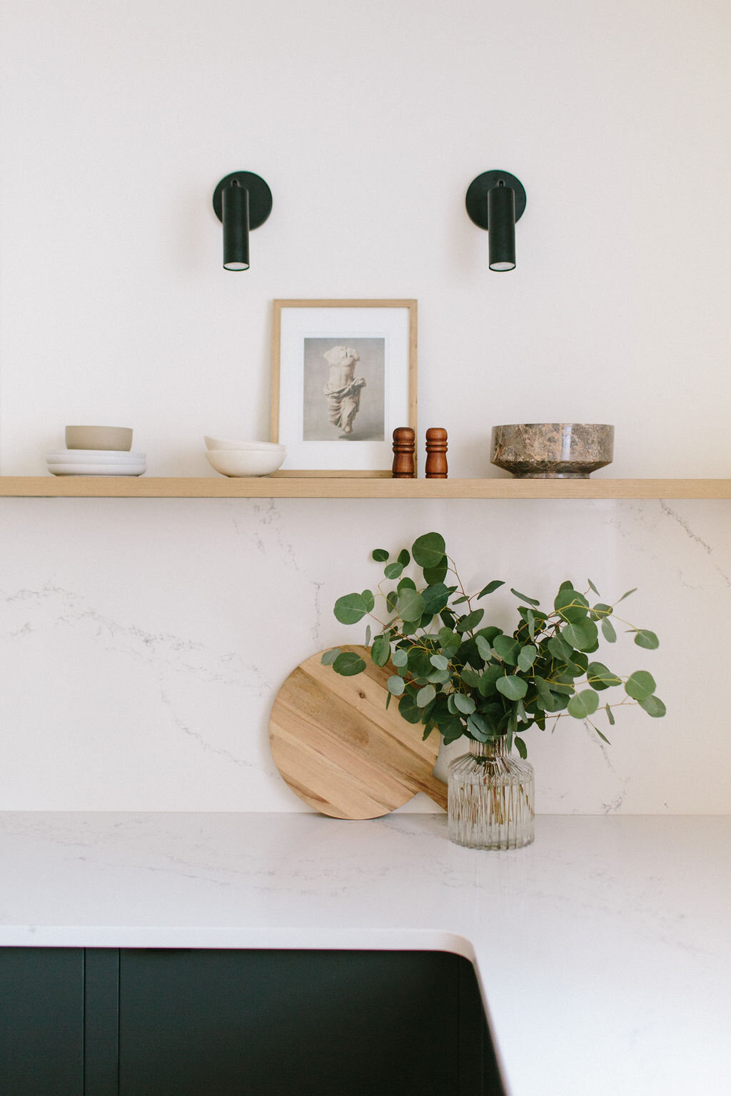
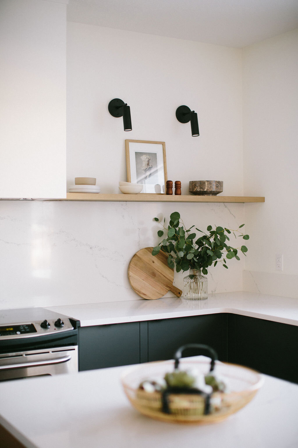
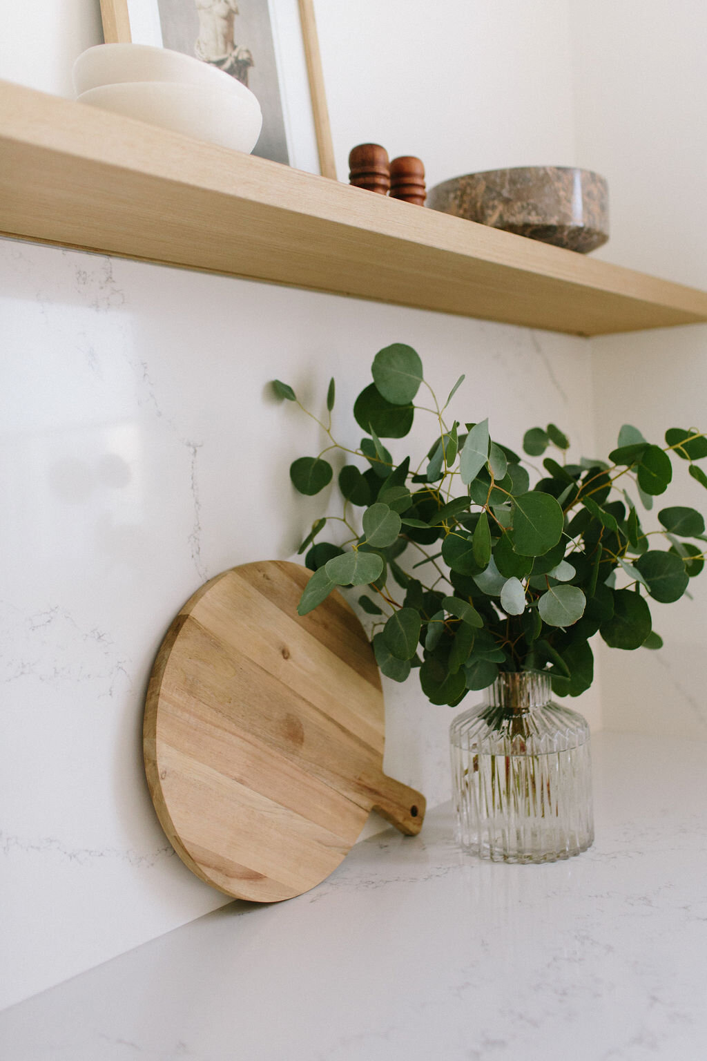
As soon as we started perusing Sharon’s Pinterest boards we noticed a consistent theme to her pins - super modern, very minimalist and she was loving the look of marble! What we don’t love about marble though, is the price point and maintenance. Enter - HanStone Quartz! The first material we selected for this renovation is HanStone’s Yorkville quartz. This quartz is our go-to countertop choice at Kresswell Interiors and one of the most popular finishes we work with most often. We love it for it’s beautiful veining and transitional appeal and for Sharon’s super modern and minimalist kitchen - we knew it would be perfect! Just look at that beautiful veining!! *cue heart eyes!*
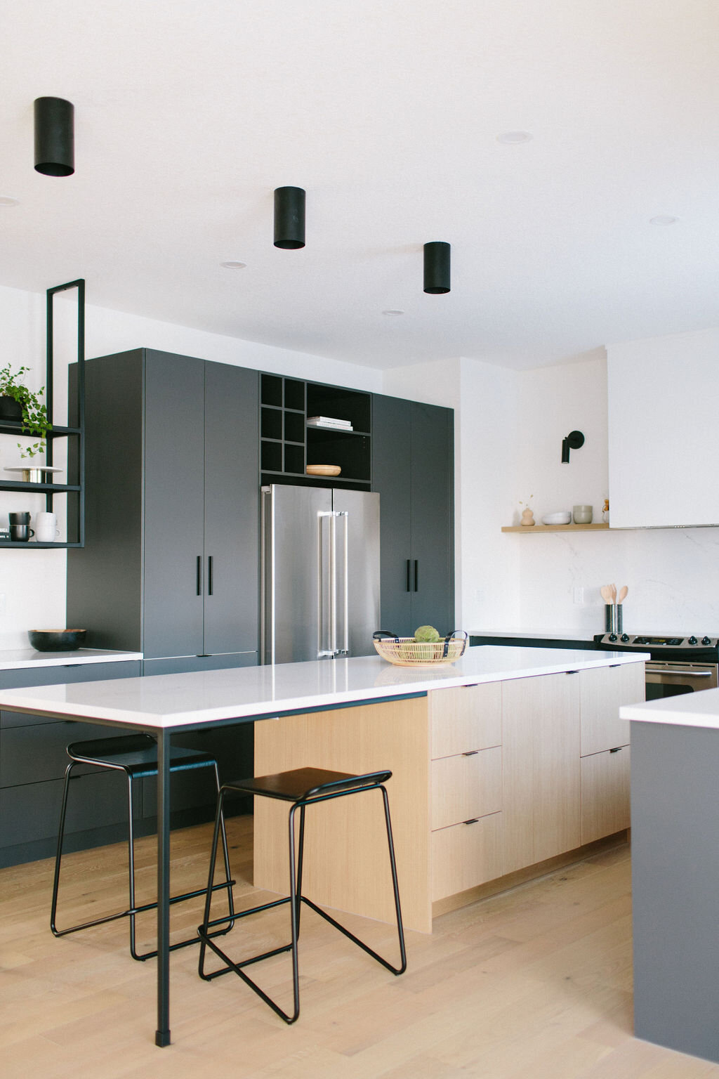
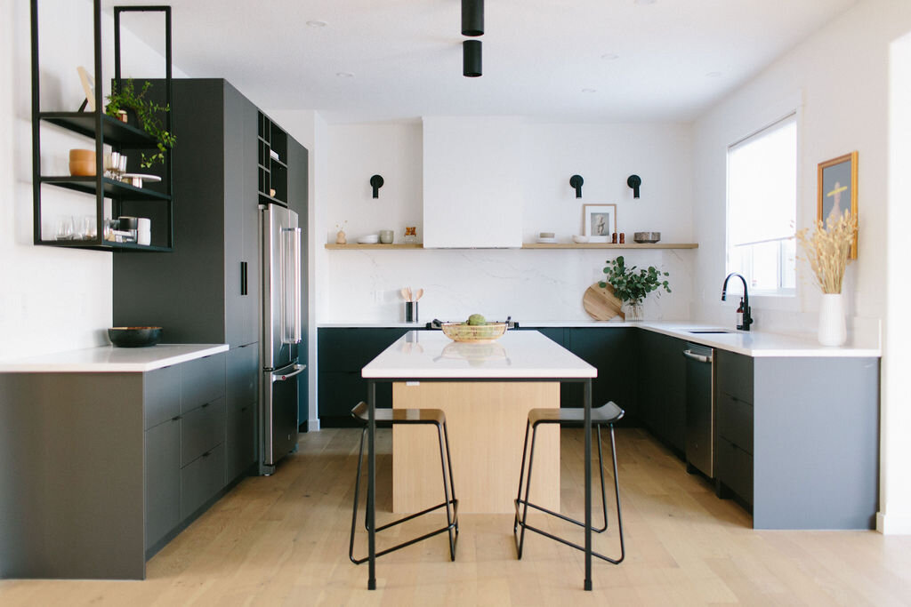
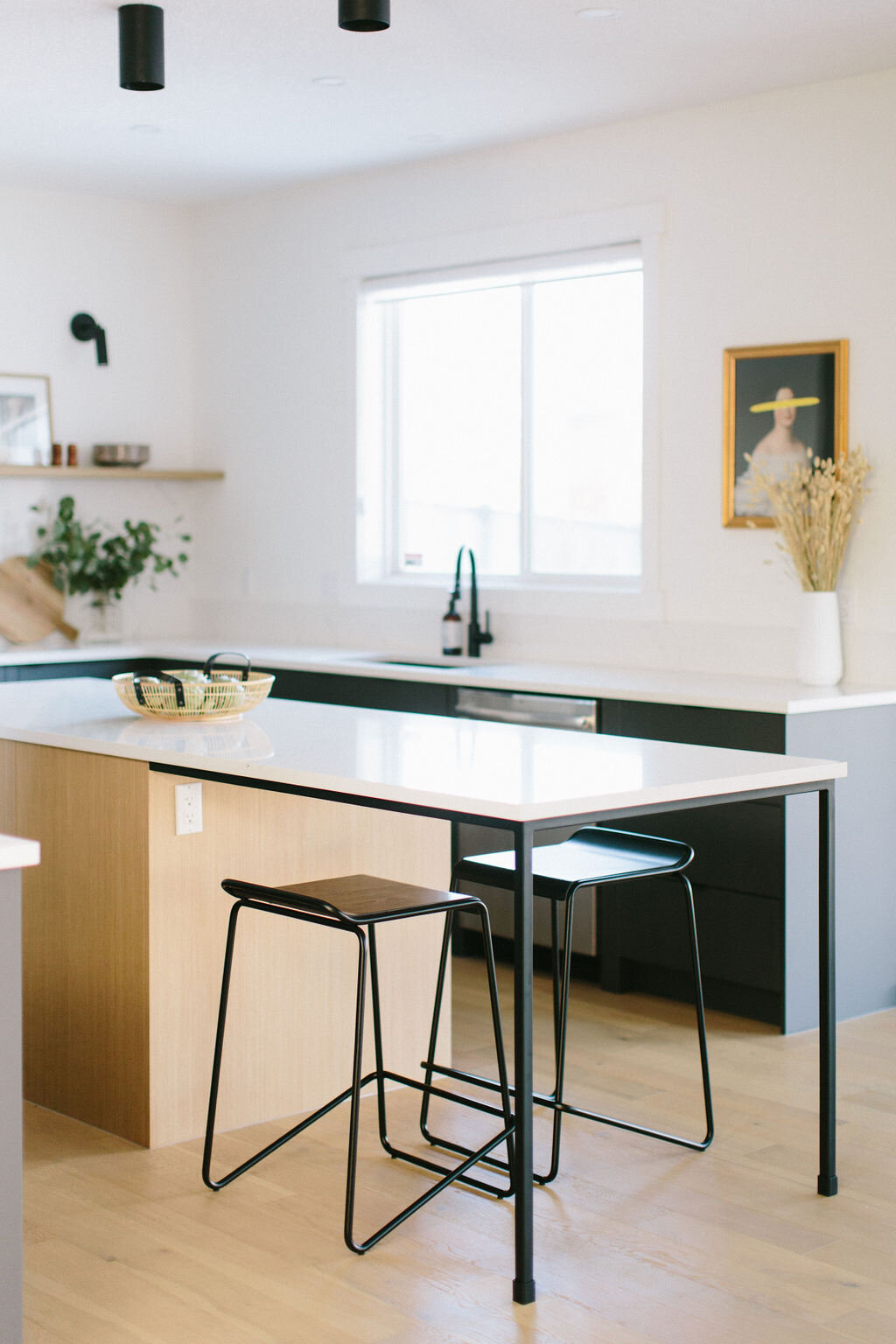
Right out of the gate we knew we wanted to use the countertop material as our backsplash as well, so once we selected the HanStone Yorkville quartz, we went on to choose the other kitchen finishes. We selected a dark charcoal cabinet finish from Kitch as our main cabinet finish choice because we love how rich it looks! We knew the deep charcoal would contrast the Yorkville quartz beautifully and then we introduced a touch of warmth through the wooden finish for the island and shelf as a contrast to the cooler finishes and to tie into the new hardwood flooring we chose.
For us this kitchen is all about contrast. The mix of black, charcoal, warm wood and the pop of the Yorkville quartz are the perfect combination, don’t you think?!
The reveal
And now for the best part! Just look at how glorious this kitchen is now!! With the crisp white walls, pops of black through the beautiful sconces and how the veining of the HanStone Yorkville quartz meets our wooden shelf, this feature wall makes my heart sing! Other notable favourite elements in this space include our custom legs for the island and iron shelf made by Iron Elements. Everything ties together so nicely, don’t you think?
What’s your favourite part of this kitchen?!
Now that you’ve seen this dramatic kitchen transformation, it’s time to show you the bathroom!
before
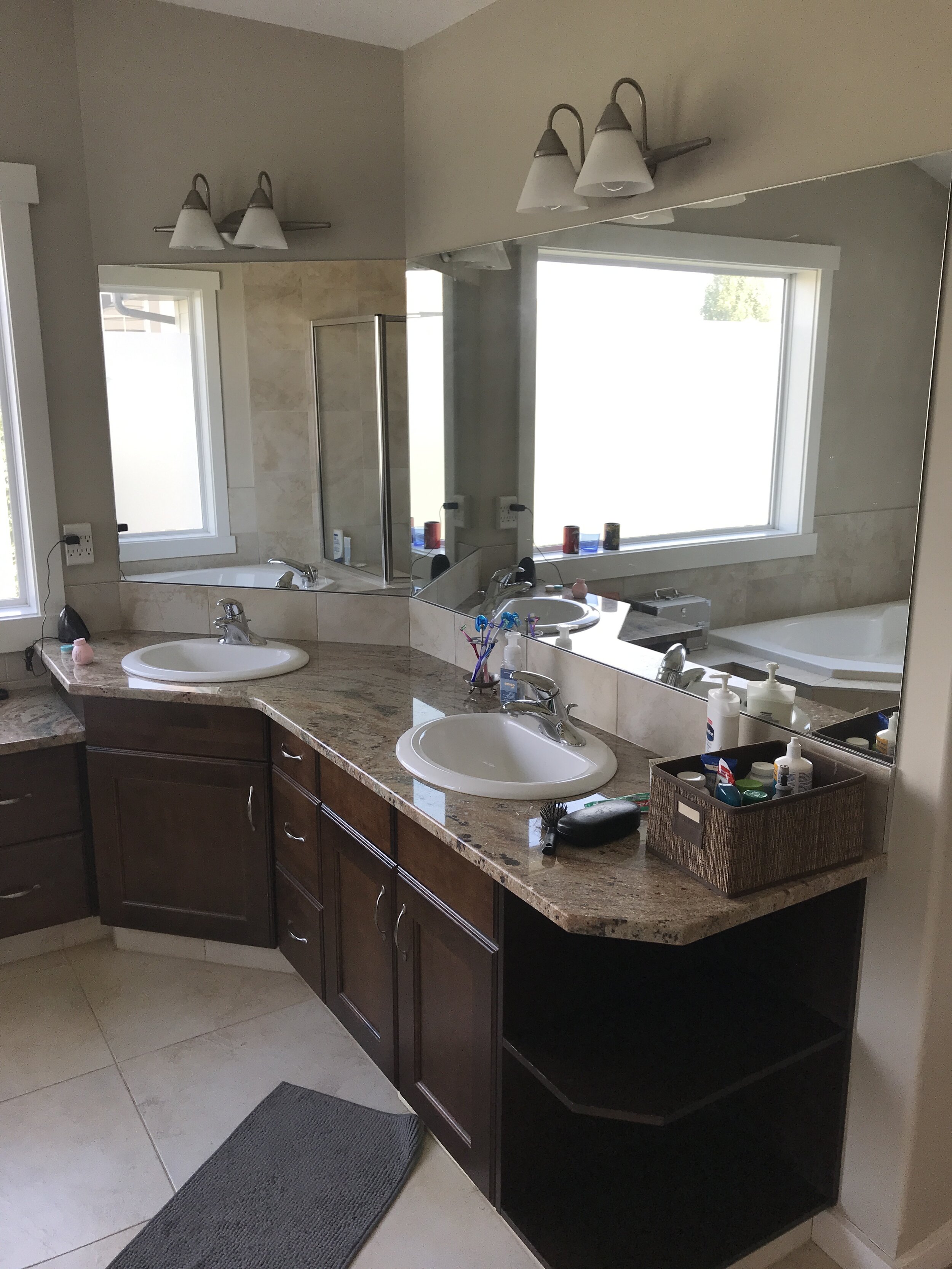
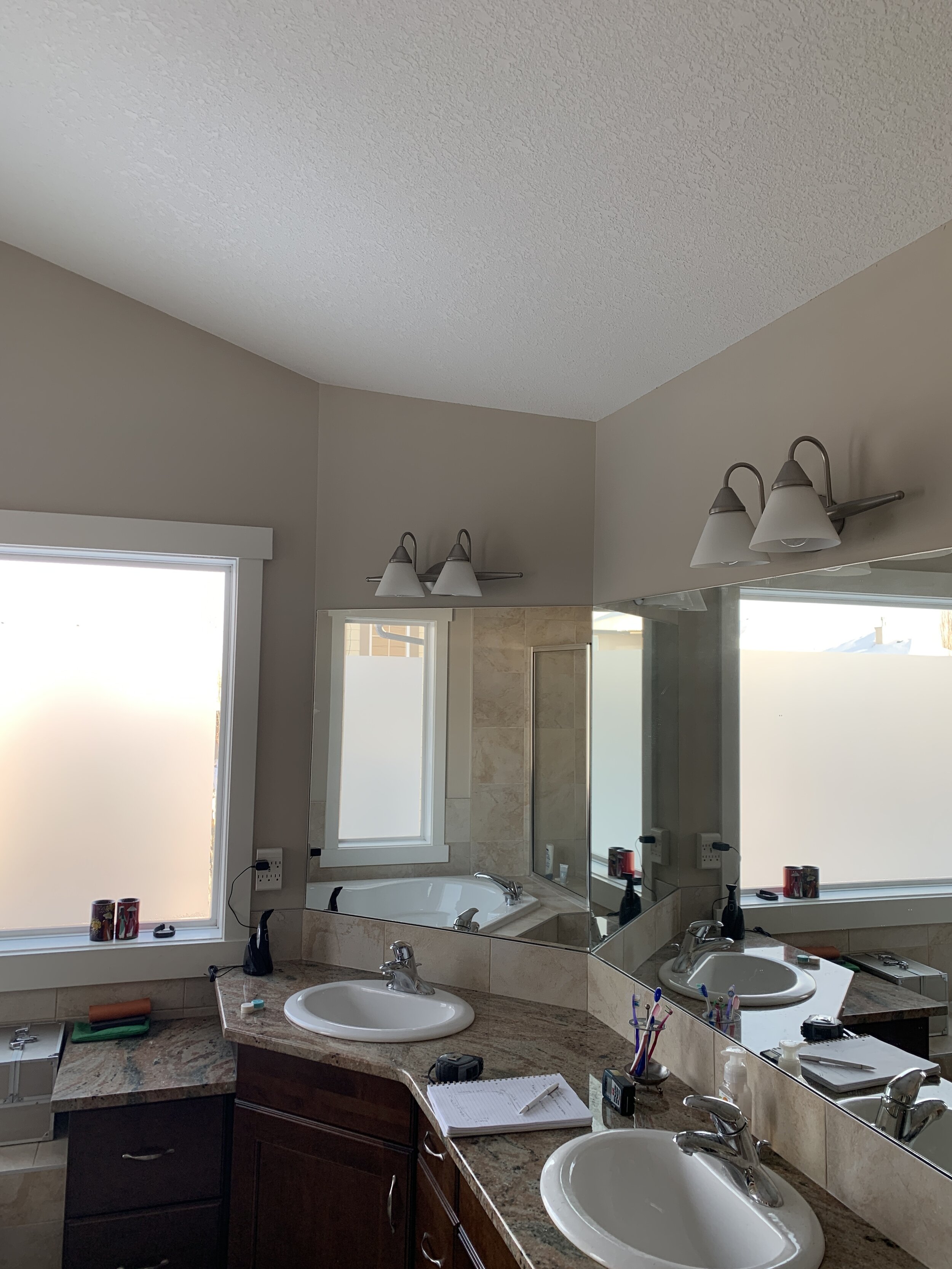
As you can see this bathroom is large and has great natural light but with lots of angles, the space felt a bit dated. Plus, the dark cabinetry wasn’t doing this room any favours. With awesome windows and fantastic tall ceilings, we knew we could turn this space into a stunning modern ensuite!
The plan
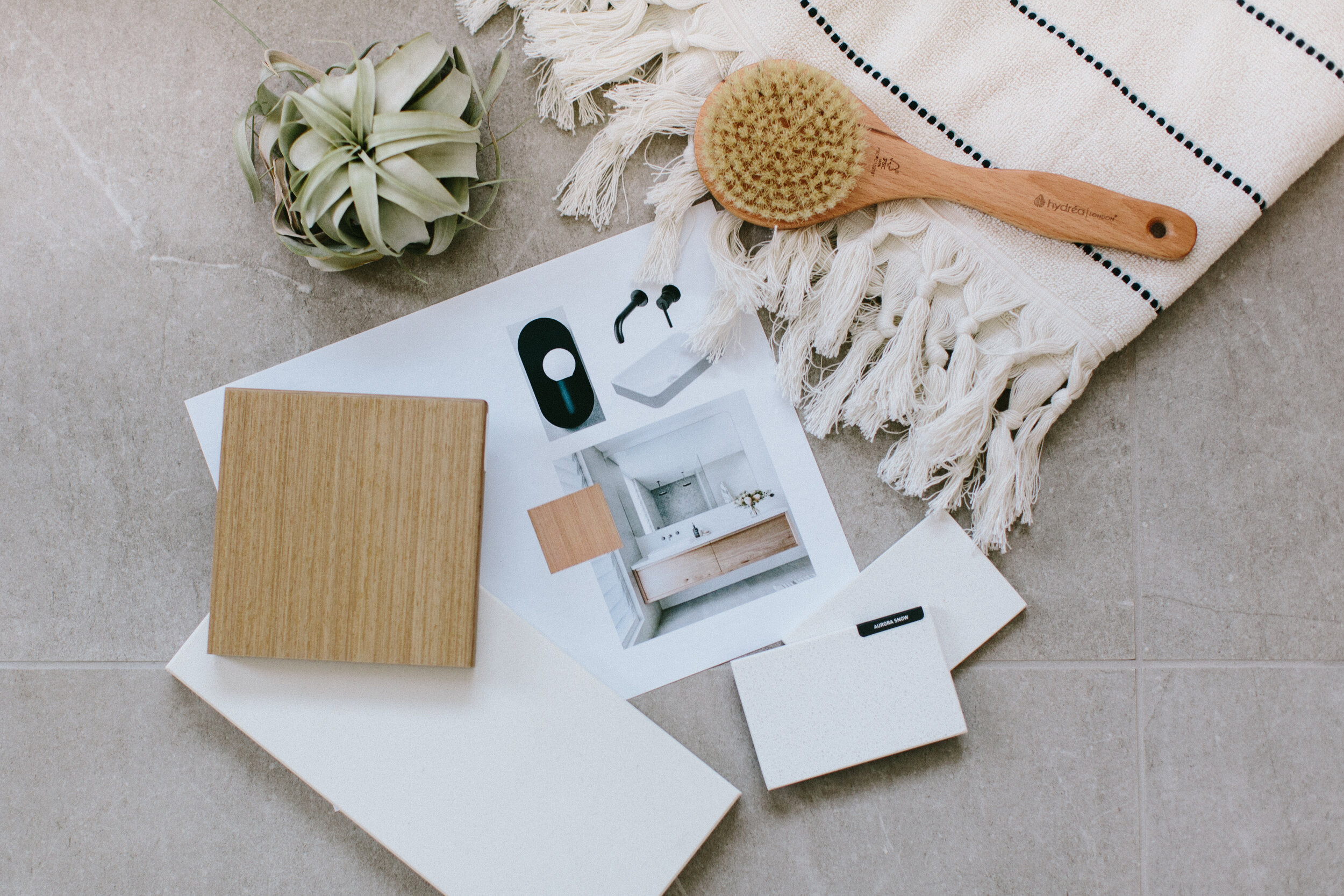
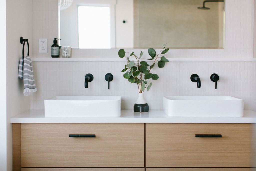
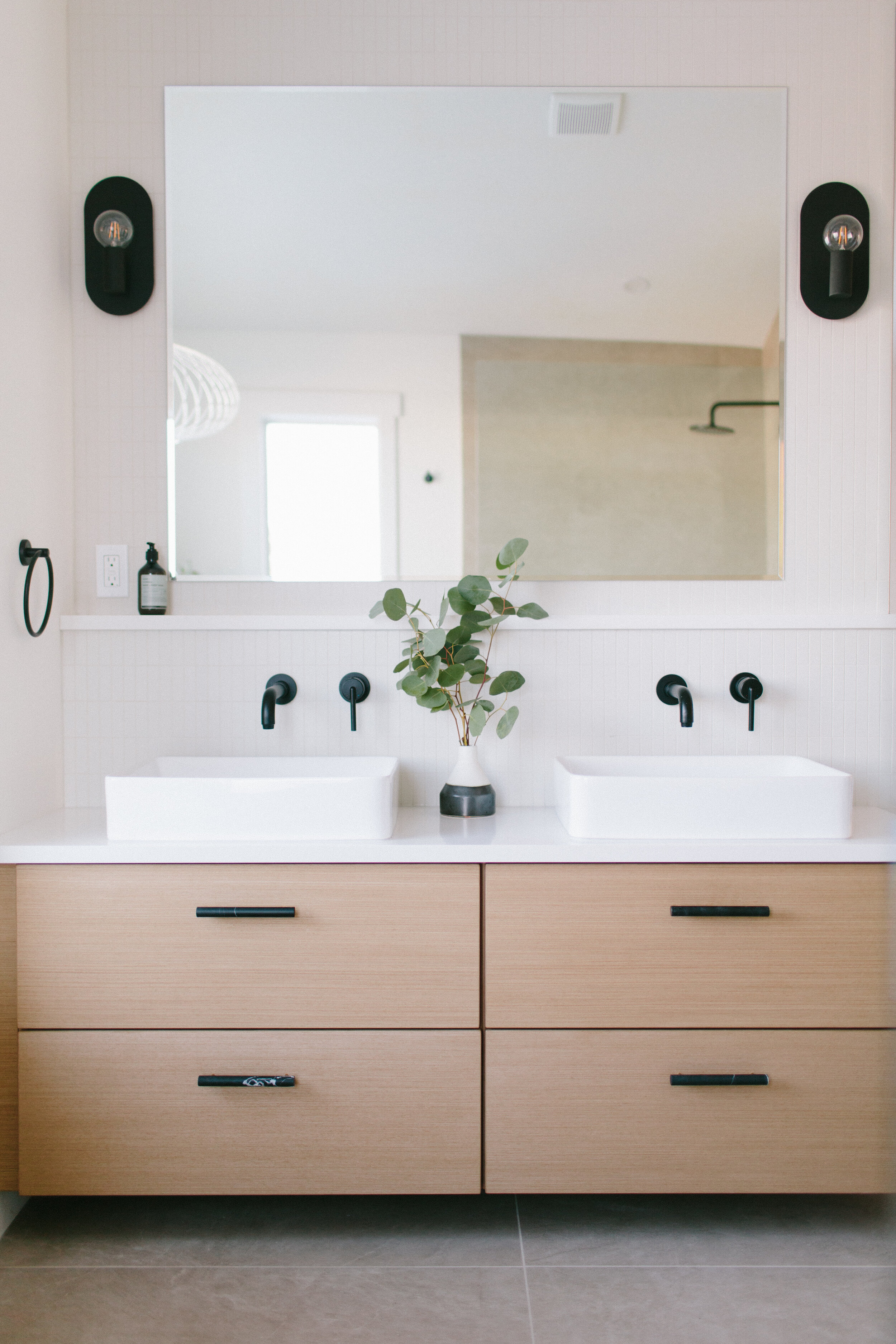
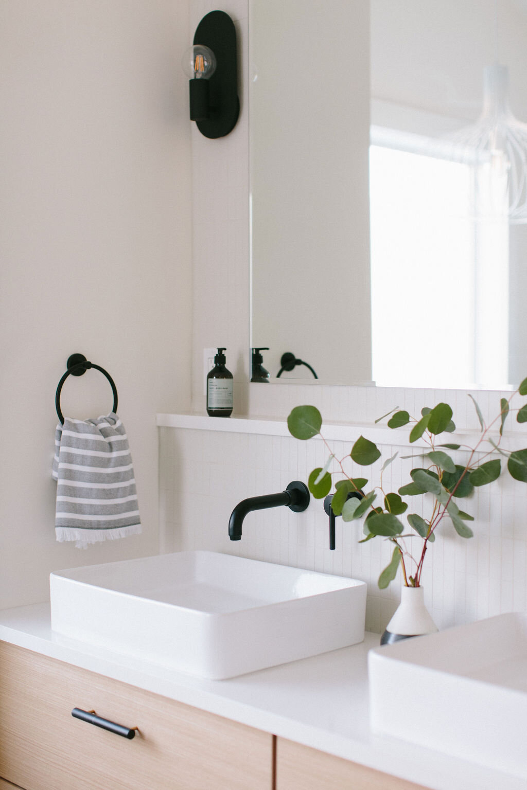
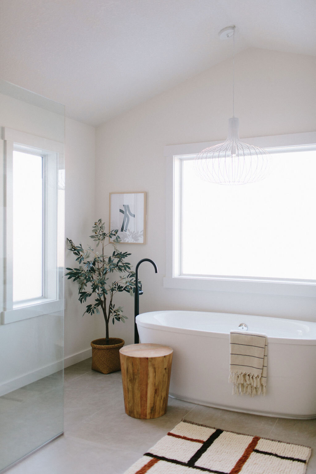
The plan for the ensuite was to keep the finishes clean, modern and neutral. Our palette was a calming combination of grey, warm wood and shades of white with pops of black for some punch!
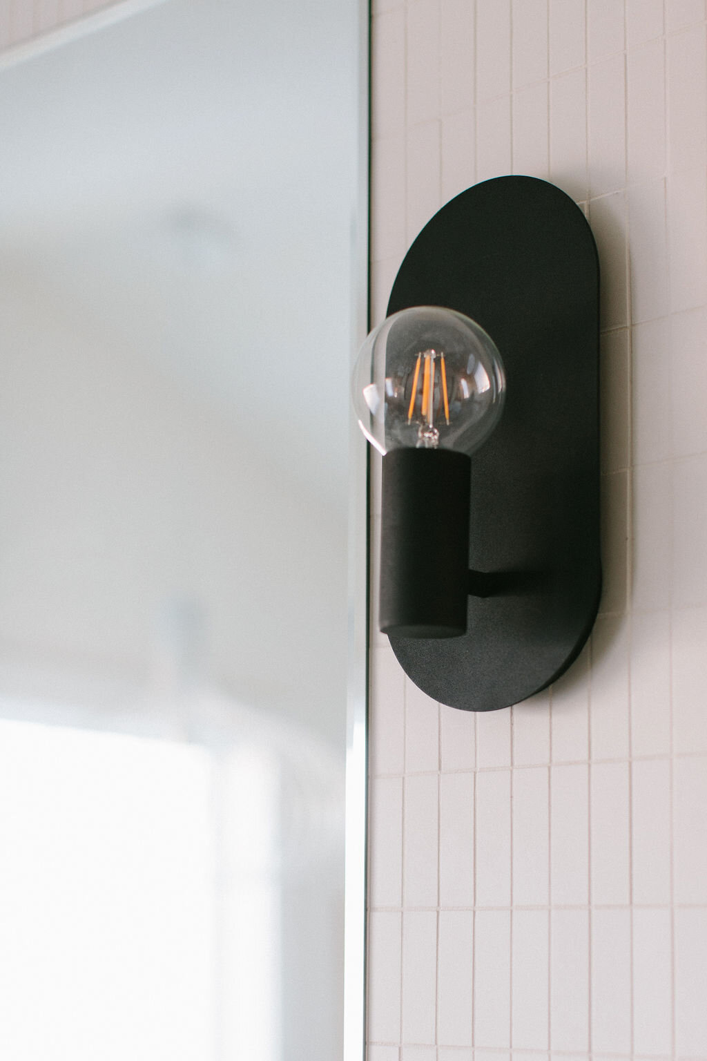
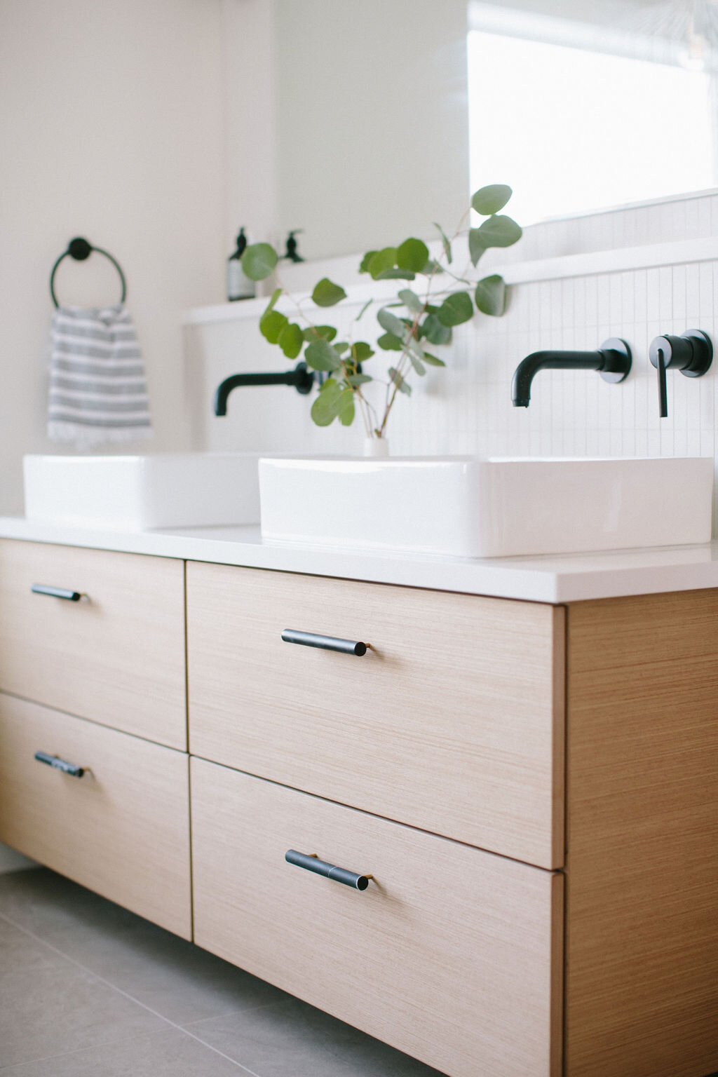
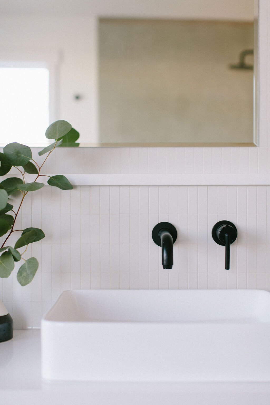
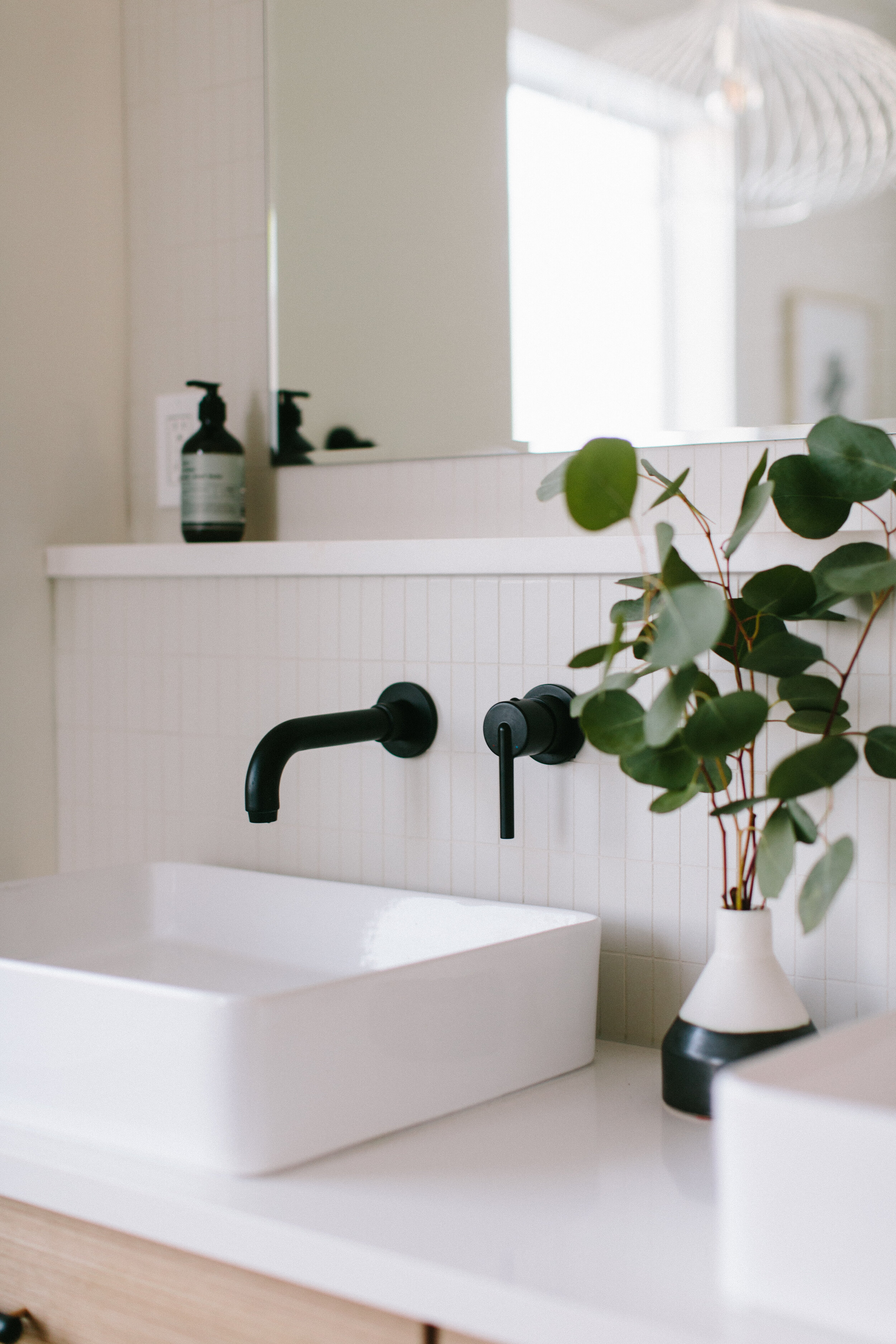
For the vanity we used the same warm wood from the kitchen island and shelf. To contrast, a large format grey tile was chosen for the floor and shower walls. We kept that finish consistent to maintain the super modern aesthetic we were going for and I love that this tile looks a bit like concrete which really suits the space! We kept the rest of the finishes simple in shades of off-white and whites and played more with textures and different finishes for visual interest. Lastly, we wanted to add a bit of contrast and some pop against all of the light and airy finishes so black lighting and plumbing fixtures fit the bill beautifully.
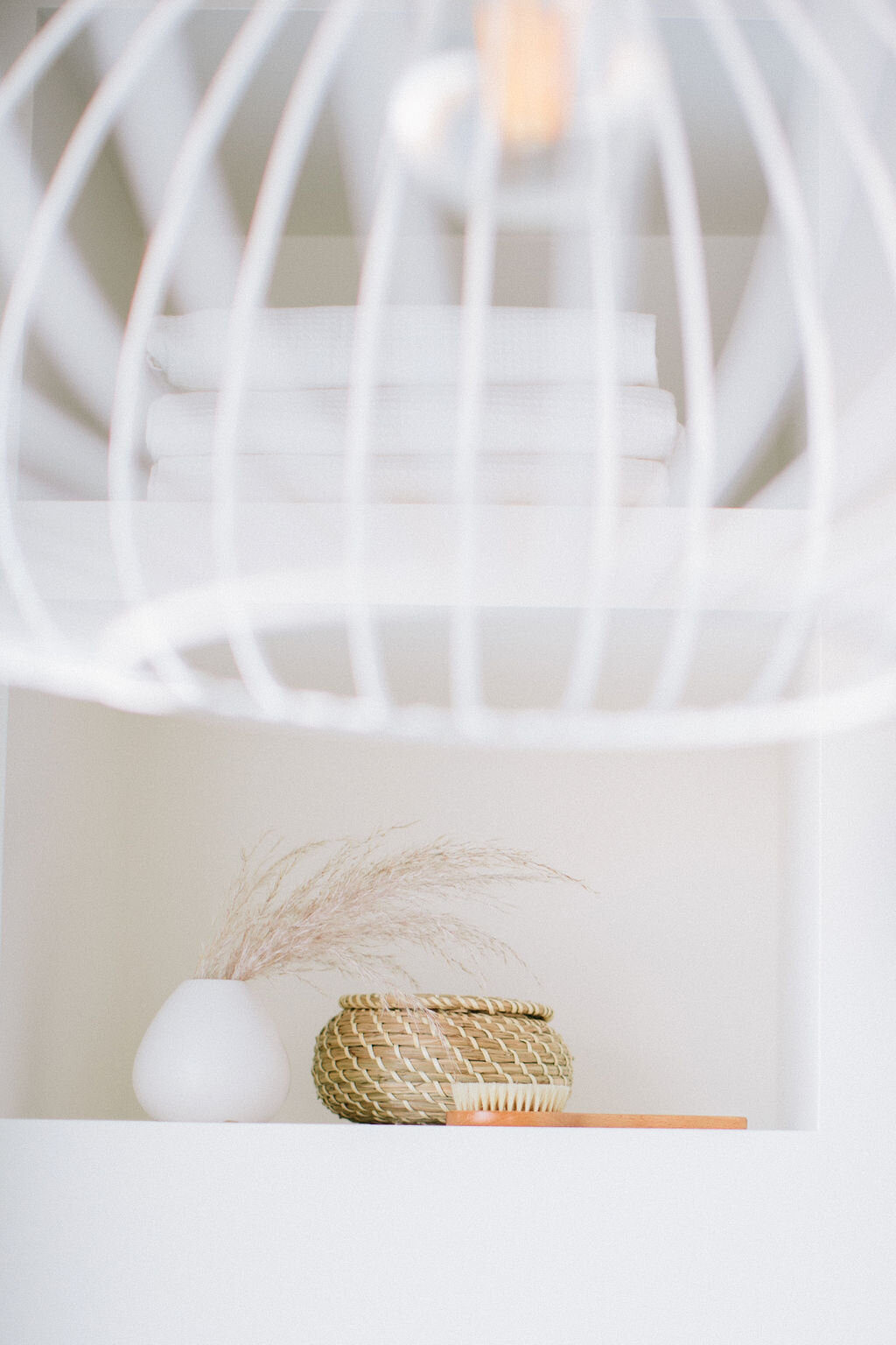
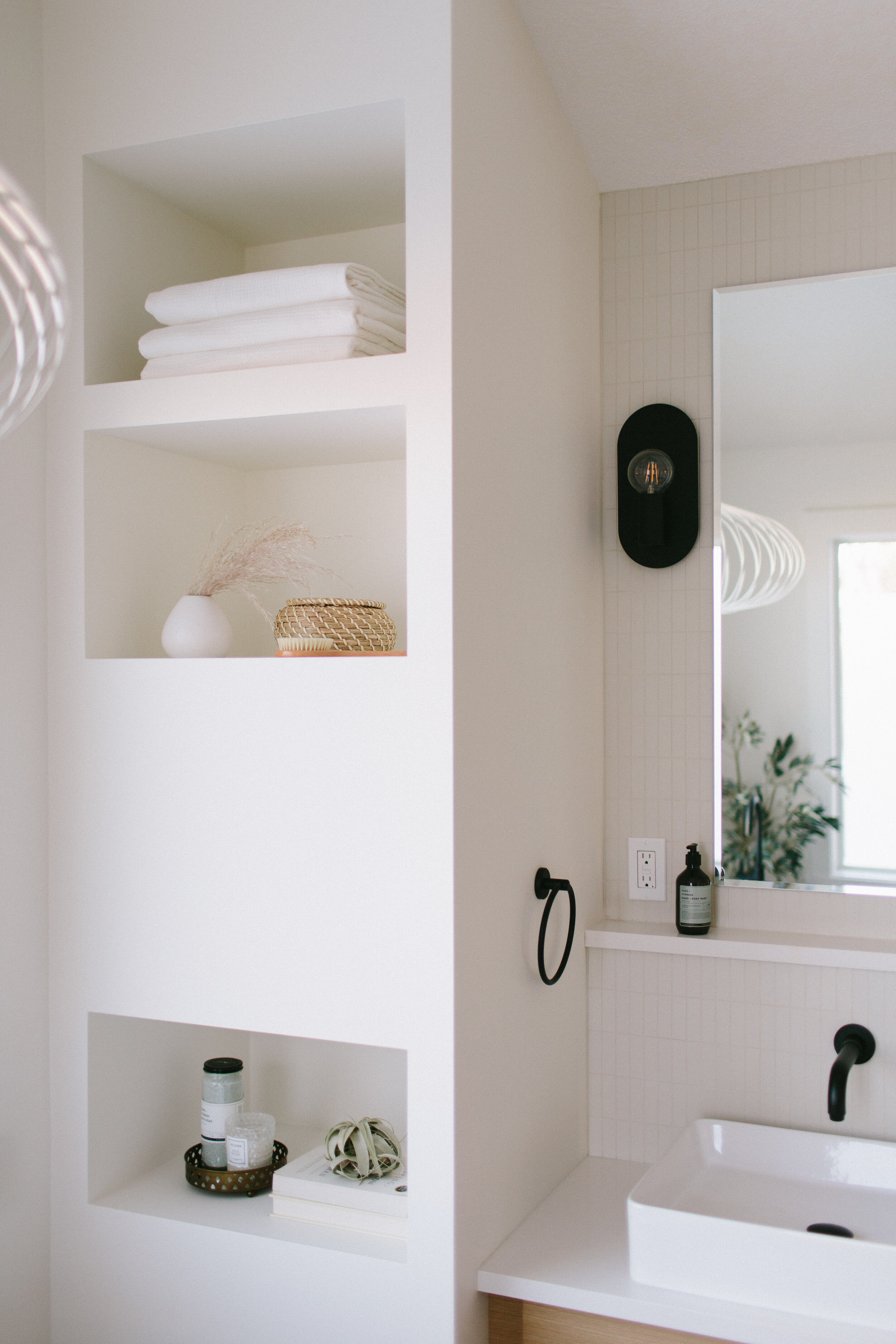
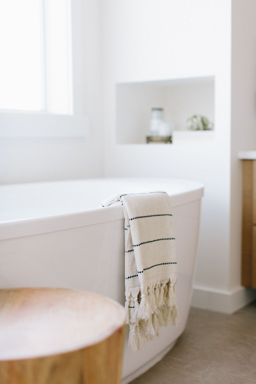
The trickiest part of planning this space came with reconfiguring the oddly shaped corner of the room. In the previous configuration the vanity angled into the built in tub which was a bit clunky and made the room feel more closed off than it needed to because there’s so much space here! In making this change we did lose two small cabinets of storage but in the end, we all agreed it was well worth it to open up the room to be more modern and in line with our vision. To compensate for the slight drop in storage we came up with two solutions. The first, was to build a few niches into our drywalled wall in front of the tub. Not only are they a beautiful feature (a genius thought by my design partner in crime, Kristina), but they add practical storage too. The second, was to use our HanStone Quartz countertop material to create a ledge above the vanity, adding a bit more practical countertop and storage space.
For this element we chose HanStone’s Angora Quartz for our countertop and our ledge material. The Bianco Canvas Quartz was the perfect shade of white for this room. A soft finish with a very subtle texture and a beautiful hint warmth to it - it not only looks fantastic with our vanity but also with our feature wall tile behind the vanity! I love this feature wall and this ledge for so many reasons. The ledge adds a practical place for soap, toothbrushes, decor or other elements without cluttering up the precious countertop space. It also adds a very beautiful feature and unique element to the room. Plus, I adore how the Bianco Canvas pairs with our backsplash tile - we chose the finish especially with that element in mind and love the super textural but still minimalist look of the tiled wall.
I just adore this bathroom and think I’ll be dreaming of this spa like space for a very long time. Talk about #bathroomgoals!
after
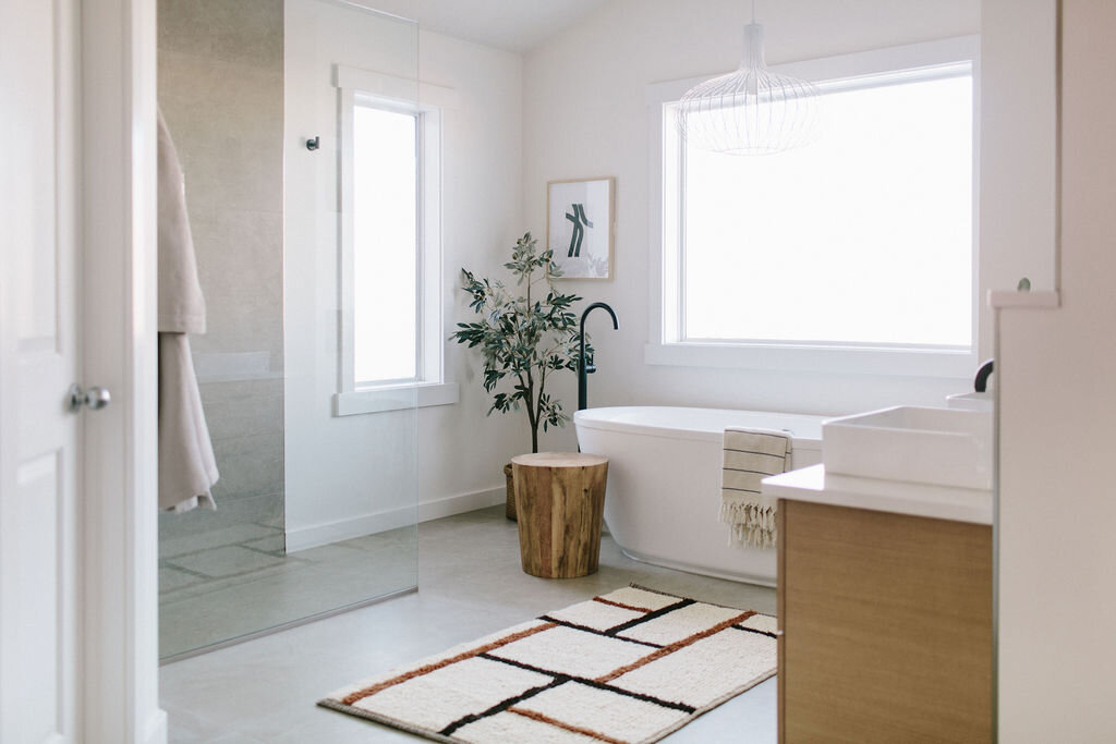
Ahhhh - isn’t this bathroom so relaxing?! Bright and airy, calming and spa like - this space is a stunner (if I do say so myself!)
I can definitely picture myself soaking in that gorgeous tub for hours just staring at the feature wall with the cubbies, and feature vanity wall - what about you?
I want to say a big thank you to HanStone quartz for partnering with us on this blog post. We use HanStone Quartz in so many of our favourite projects (including the recent #TheEmeraldLady), so being able to work with one of our favourite suppliers is pretty much a dream come true! Thank you for supporting the brands that support this blog and Kresswell Interiors.
Photos: Sharon Litchfield Photography
Renovations: Revive Developments
Interior Design: Kresswell Interiors
Please note out of respect for our paying clients, we cannot divulge all sources and materials used in our projects!
