Coffee Table Styling 101
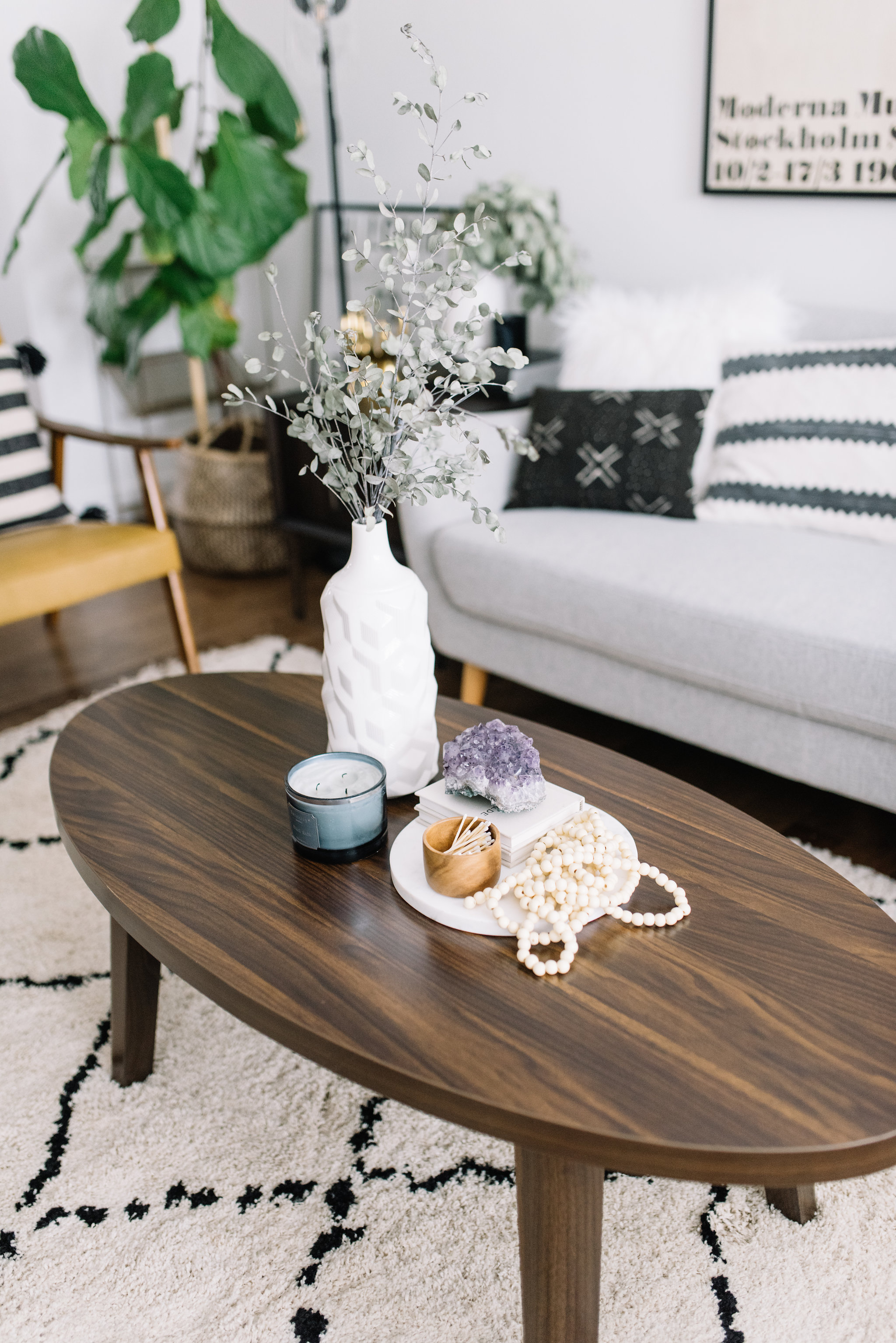
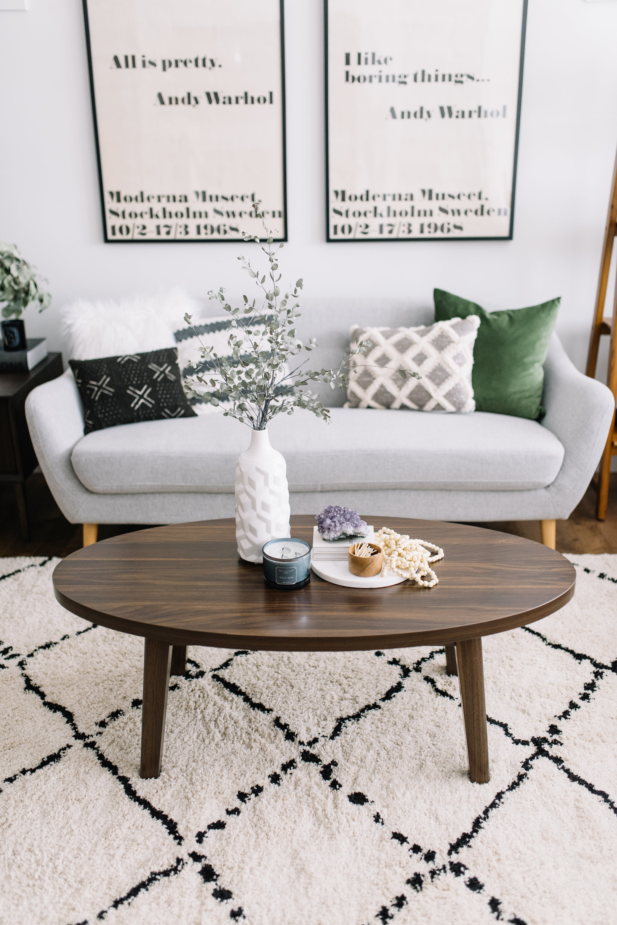
Today I'm excited to talk to you guys about one of my favourite topics - styling! More specifically, coffee table styling. One of the most frequently asked questions in my IG inbox is for styling suggestions whether it be for a console table, bookshelf or coffee table so today, I thought I'd share a few of my go-to coffee table styling tips. When James and I picked up the Wilson Coffee Table from The Brick, I thought it would be the perfect blank canvas to use for a little coffee table styling 101. The Wilson Coffee Table is a great piece to anchor a living room. It's a rich wood with clean lines, a mid-century modern vibe and an oval shape that's perfect for a home with children or pets.
*Designer Tip: I love coffee tables with rounded edges, more often than not I pick tables like this for my clients. The organic shape of rounded edges works well in a variety of styles and they're often easier to work around when adding other pieces to the room. Not to mention, less hazards for knees, shins or noggins (for the littles) with sharp corners!
By now you all know that I'm a bit of an accessories hoarder! I love to collect pieces and swap out my accessories when I feel the need for a creative refresh. One of my go-to sources is The Brick. Many of you may not know that The Brick actually has a ton of accessories in store that you can take home the same day. Because every store has a slightly different selection you can't see them online because they're constantly getting in new accessories all the time! I've had great luck finding some awesome pieces such as marble trays, ceramic vases, faux greenery, candles and other decorative objects many of which I've used today!
I've put together 3 different accessorized coffee table looks today and with those looks, I'm sharing a few 'rules' of coffee table styling. Take a look through and let me know, which look is your favourite? But first, here's a list of a few of my 'styling essentials'
Books - grab a few coffee table books (pro tip - take the covers off of your hardcover books, I almost always do!)
Candles and candle holders
Greenery
Vases of Varying Heights
Small dishes - wooden, brass, ceramic - grab a variety of materials
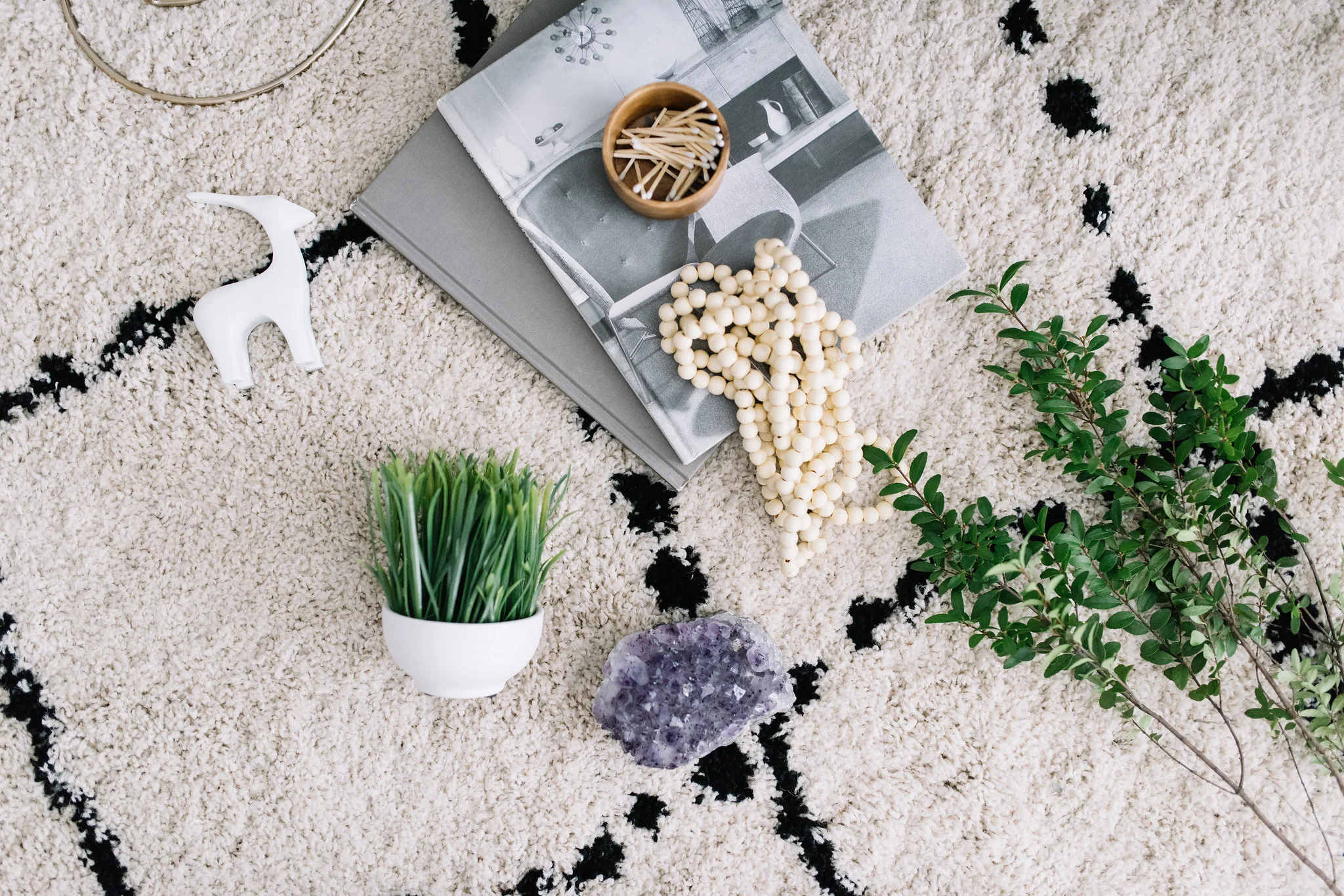
Natural accents - think wooden beads, crystals - bring in touches of nature!
Okay, do you have your supplies? Let's get started!
Coffee Table Styling Tip #1: Use Accessories of Varying Heights
My first tip is to vary the scale of the pieces you use. Balance your styled vignette with accessories of varying height. Create groupings that include pieces that are tall, medium height and low. Here, you can see I used tall candles placed on books to create the highest level in my grouping. A shorter white vase and faux greenery add the 'middle' height and a smaller accessory is the lowest level. For this grouping I've also chosen a more monochromatic setting using neutrals such as greys, whites, metal and greenery (which is a neutral in my opinion!)
LIVING ROOM FURNITURE DETAILS: Area Rug: Ahmar - The Brick // Sofa: Calla - The Brick // Lamp: Glass Task Lamp - The Brick // Side Table: Kisper - The Brick // Coffee Table: Wilson - The Brick
Coffee Table Styling Tip #2: Add Natural Touches
When styling a grouping it's important to always bring in natural touches whether it be through faux (or real) greenery, a crystal, rock or stone accent or through wooden elements. What's great about natural elements like these is that they work with pretty much any design style. For greenery I love to grab real branches such as eucalyptus because they're beautiful when they're fresh but they also dry out beautifully and can last for months (these ones in my white vase from The Brick have actually lasted me close to a year!). Marble and stone accents add texture and color and when you pick wooden elements opposite to the piece of furniture you're styling they contrast beautifully! Case in point with the high contrast of the light wooden beads and the rich wood of the Wilson Coffee Table.
Coffee Table Styling Tip #3: Vary Your Materials
My last coffee table styling tip is to vary the materials and textures you use to style. You can see here that I have used a variety of textures and materials with this grouping. I've mixed marble with wood, glass with brass, textured faux florals with a geometric vase and I've added books of varying heights, colors and texture to ground the groupings. Great design and decor comes from putting together pieces of varying styles and textures in a way that they compliment one another without being too 'matchy matchy'. For this particular grouping I wanted to put together a more 'feminine vignette' using shades of pink, but balance the grouping with a pop of brass, a bit of black to ground the grouping and of course, a bit of white (marble) to make the grouping pop. What do you think?
Which grouping is your favourite? Let me know in the comments below!


