White and Walnut Modern Kitchen
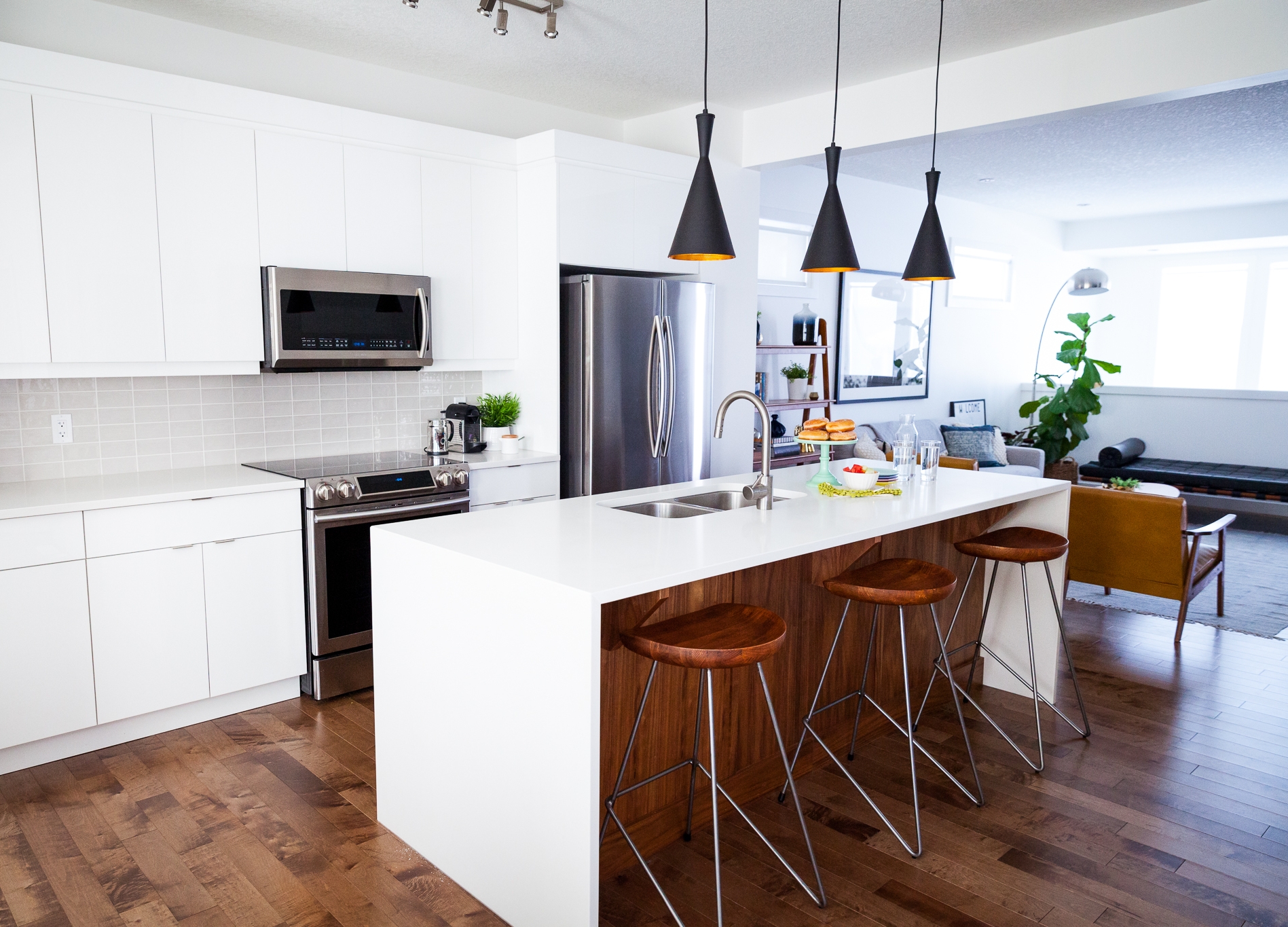
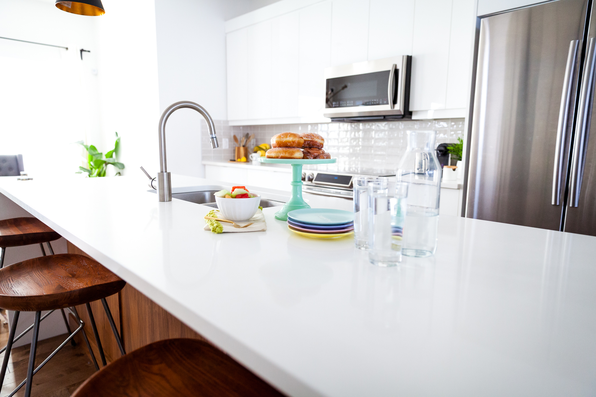
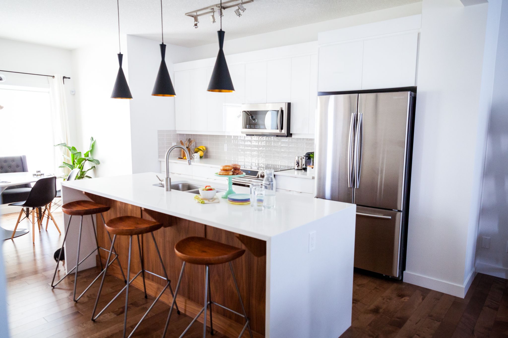
Well after over six months of living here, I figured it might be finally time to show off our kitchen! Our kitchen was the room James and I definitely disagreed on the most. It's the room that's the most expensive to make changes to when you're building a new house and there are so many decisions to make. From lighting to fixtures, hardware, appliances, finishes and more...we spent a lot of time working on this space and I'm so happy with how it turned out.
High gloss white cabinets keep the room feeling bright and open while the walnut island grounds the room. We upgraded all of our appliances since we do A LOT of cooking, we wanted to get good appliances that would work well and also be sleek and unobtrusive in the kitchen design. We looked into switching the track lighting for pot lighting but that ended up being surprisingly complex so I chose the least obtrusive track light I could get (believe it or not it's the most expensive light fixture in the house haha) so that the 3 pendant lights over the island could take centre stage. To stick with the sleek look and clean lines, we opted for no hardware on the upper cabinets, and sleek hardware on the lowers. Finding a backsplash in a soft grey wasn't easy - we had a very particular look we were going for and thankfully we found the perfect tile with a bit of texture, a bit of shine and the perfect soft grey. The waterfall countertop on the island is the finishing touch that really completes the room. I fought James on this because of the cost but ultimately, it's one of my favourite features in the house.
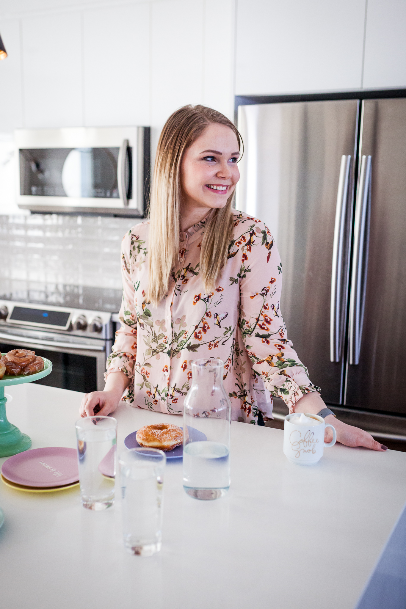
A few weeks ago when Carling came over to take some photos I was so happy she was able to snap some pictures of this space!
Another HUGE thank you to Carling Stiksma for taking these photos!!
