2019 Interior Design Trends: Part Two
Today it’s time to share Part Two of my Design Trends for 2019! AKA my favourite posts to write ever! haha ICYMI check out Part One here then come on back and let’s get right to it!
Darker Cabinets and Countertops
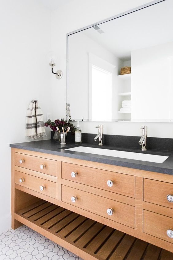
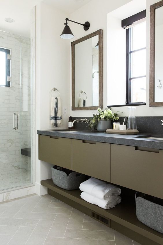
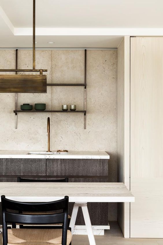
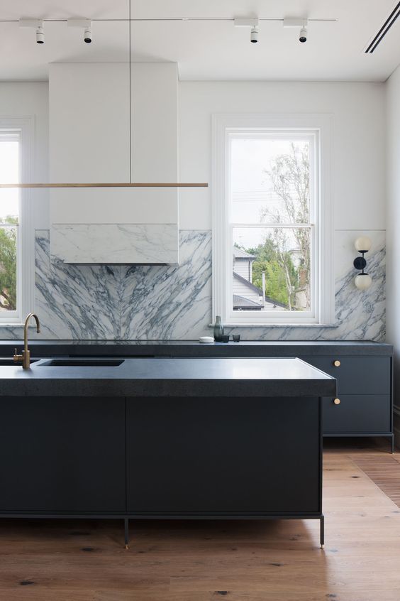
Okay so given the fact that I obviously love #TheOliverEscape I know this might seem like a biased prediction but darker kitchens are on the rise! White kitchens are always going to be classic but I’m seeing a lot more drama coming into the kitchens popping up all over Pinterest and Instagram. In addition to darker cabinets (black, grey, dark wood, deep greens and blues), I’m seeing a lot more darker countertops too! Now don’t fret - these aren’t your 90s sparkly black granite countertops, these are deep rich quartz and granite slabs with depth and texture that really adds to a space. In addition to dark on dark - watch out for more and more dark countertops popping up in bathrooms with warm wood vanities too. I’m a fan! What do you think?
Minimalist/No Hardware
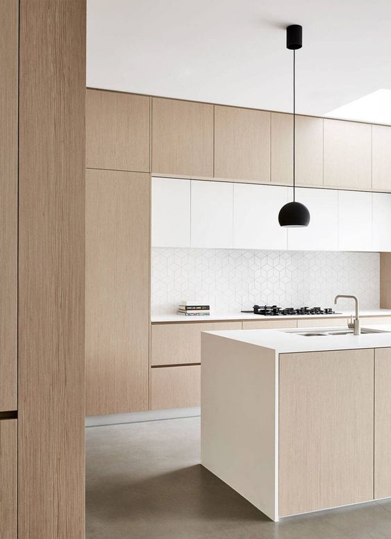
Do you remember the early 2000s when everyone had those large, long cabinet pulls? It was hardware overload in the kitchen and fast forward 10 years later, minimalism is where it’s at! Think push hardware cabinets, minimalist pulls or small, simple hardware in the kitchen. I think in kitchens there’s a big trend towards minimalism and clean lines so naturally little to no hardware fits right in with that aesthetic. I personally love the look - in my own kitchen we have no hardware on our uppers (just hidden push hardware) and on our lowers we have very minimalist pulls that Kristina and I also used in the kitchen in #TheDuchessOnTheDrive. Are you a fan of the minimalist hardware look or do you prefer something more substantial in your own space?
Wall Sconces
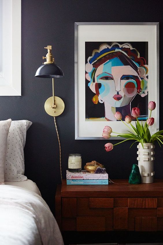
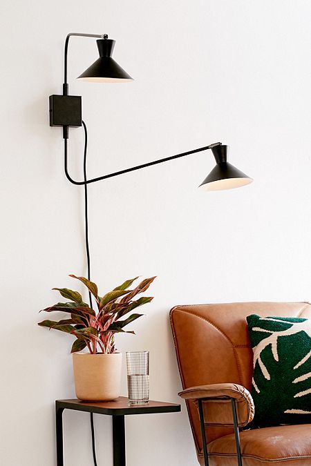
Okay, so wall sconces are always a good choice in my opinion but thanks to the popularity of wall sconces all over Pinterest and Instagram I’m seeing a big shift away from floor/table lamps in favor of wall sconces. There are so many reasons to love wall sconces but what I especially love about them is they add visual interest like art would on your wall but then they also offer the added function of task lighting in a space. You can select a fixture that’s hard wired for a more permanent/built in look but I’m also a huge fan of the sconces that are plug in and the cord becomes a part of the look! What do you think? Would you swap your lamp for a sconce?
Aged/Soft Brass
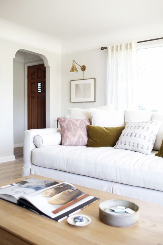
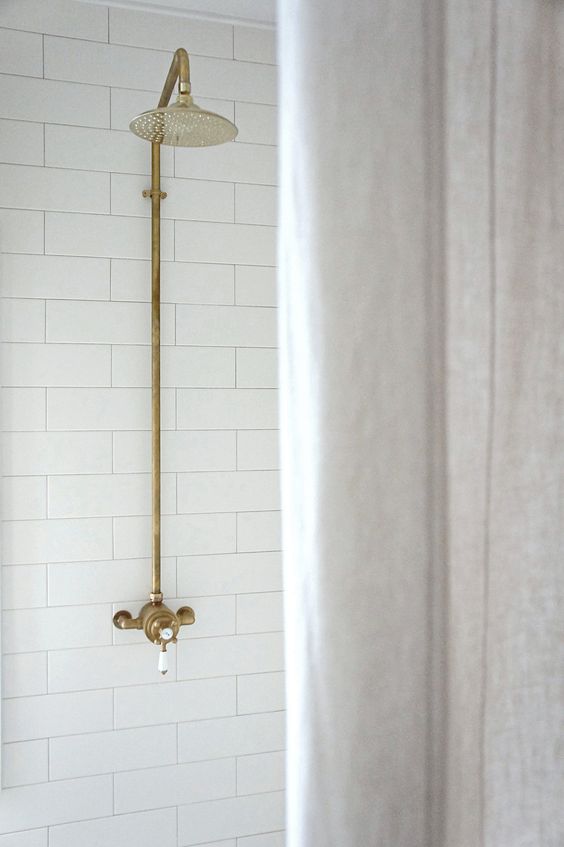
Brass has been on the rise for a few years now but the latest shift with this hot metal is the change from the high gloss, bright yellow-tones brass to more of a subtle, softer, aged looking brass. I for one am all for this! I think the look is more classic, pairs beautifully with other metals (because mixing metals is always a good idea if you ask me) and I love the more refined look of a slightly aged brass. What do you think?
Image Via
What do you think of some of my trend predictions? There are of course so many more but these ones are my fave. Let me know your favourite (whether it was included or not) in the comments below!


